How To Configure Branding for React POS UI
Introduction
The Enactor React POS UI can be customised with client-specific branding including logos, background images, colour schemes, and fonts. This is achieved by uploading images via Image Maintenance in Estate Manager and loading custom CSS stylesheets via Stylesheet Maintenance.
The purpose of this guide is to demonstrate how to change the logo, sign-on background image, and other visual elements for a React POS UI, and how to customise the colour scheme for all major UI sections.
Overview
This guide covers the configuration of the following:
- Image Setup - Creating image categories and uploading branding images (logo and background).
- CSS Stylesheet Setup - Creating and loading CSS to reference the uploaded images.
- Customising UI Sections - Applying CSS styles to the header, number pad, keyboard, right panel, footer, row selection, buttons, product search, and product detail view.
- Fonts - Applying a custom font to the POS UI.
Image Setup
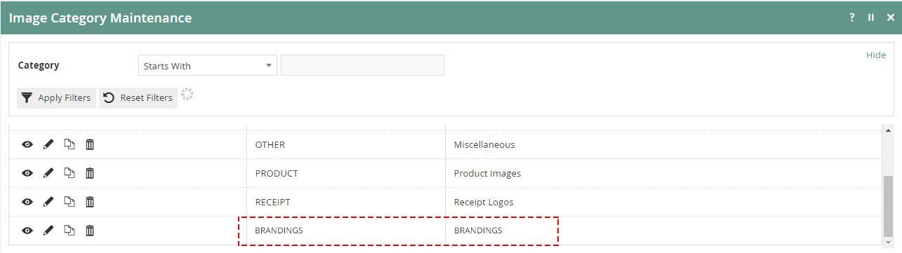
Create a Category
First, create a new image category where you want to add images.
You may skip this step if you have already created a category or are planning to use an existing one.
Upload Images
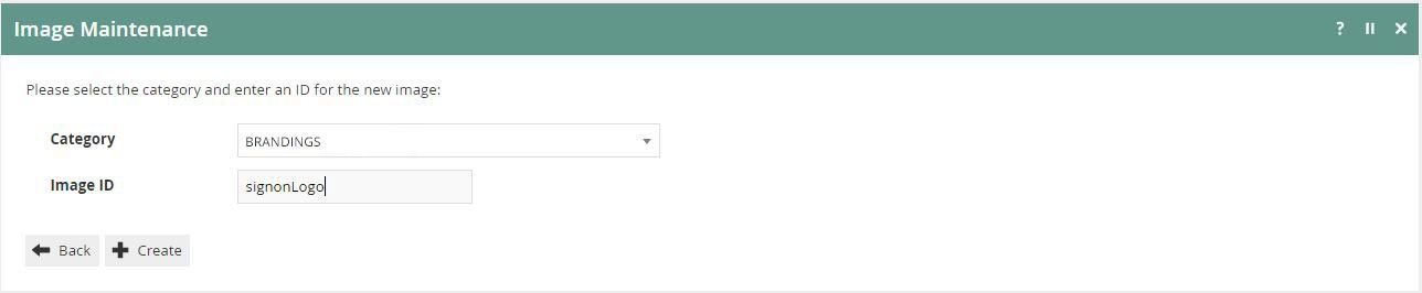
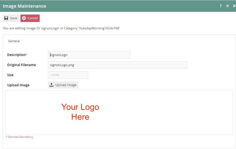
Step 1 - Create an image. Select the image category where you want to add images and type the Image ID. For convenience, use the file name as the Image ID.
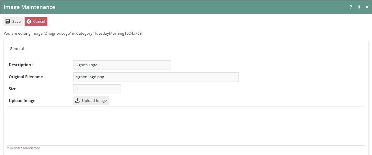
Step 2 - Fill in the Description and Filename fields, then press the Upload Image button.
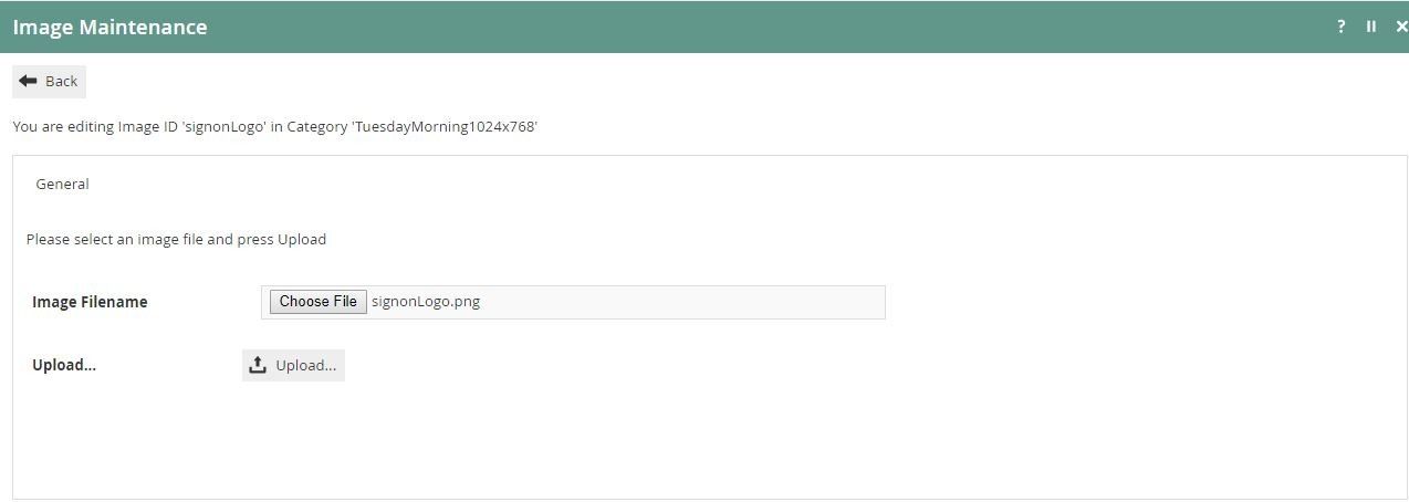
Step 3 - Upload the image file. Make sure to keep the same dimensions:
- Logo and Sign-on Logo - 240 x 80 (px)
- Background Image - 1920 x 1080 (px)
Step 4 - Save the changes.
CSS Stylesheet Setup
Update the CSS
Create a new CSS file containing the following classes, and load the file into Stylesheet Maintenance on your Estate Manager.
The Stylesheet ID that you create must end in .css (e.g. ClientStylesheet.css).
Images
.signon .body-area {
    background-image: url("image://BRANDING/BackgroundImage.jpg");
}

.signon .hdr-area .hrd-logo {
    background-image: url("image://BRANDING/signonLogo.png");
}

.hdr-area .hrd-logo {
    background-image: url("image://BRANDING/signonLogo.png");
}
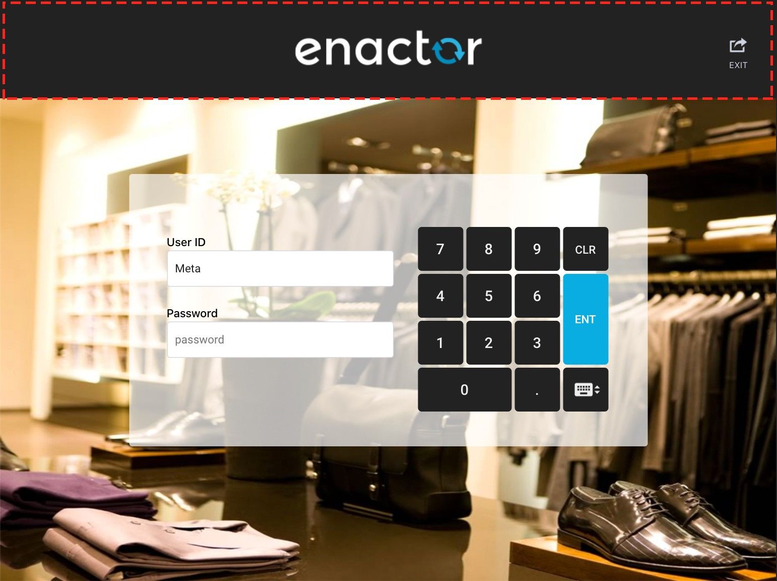
Sample logo:

Sample background image:


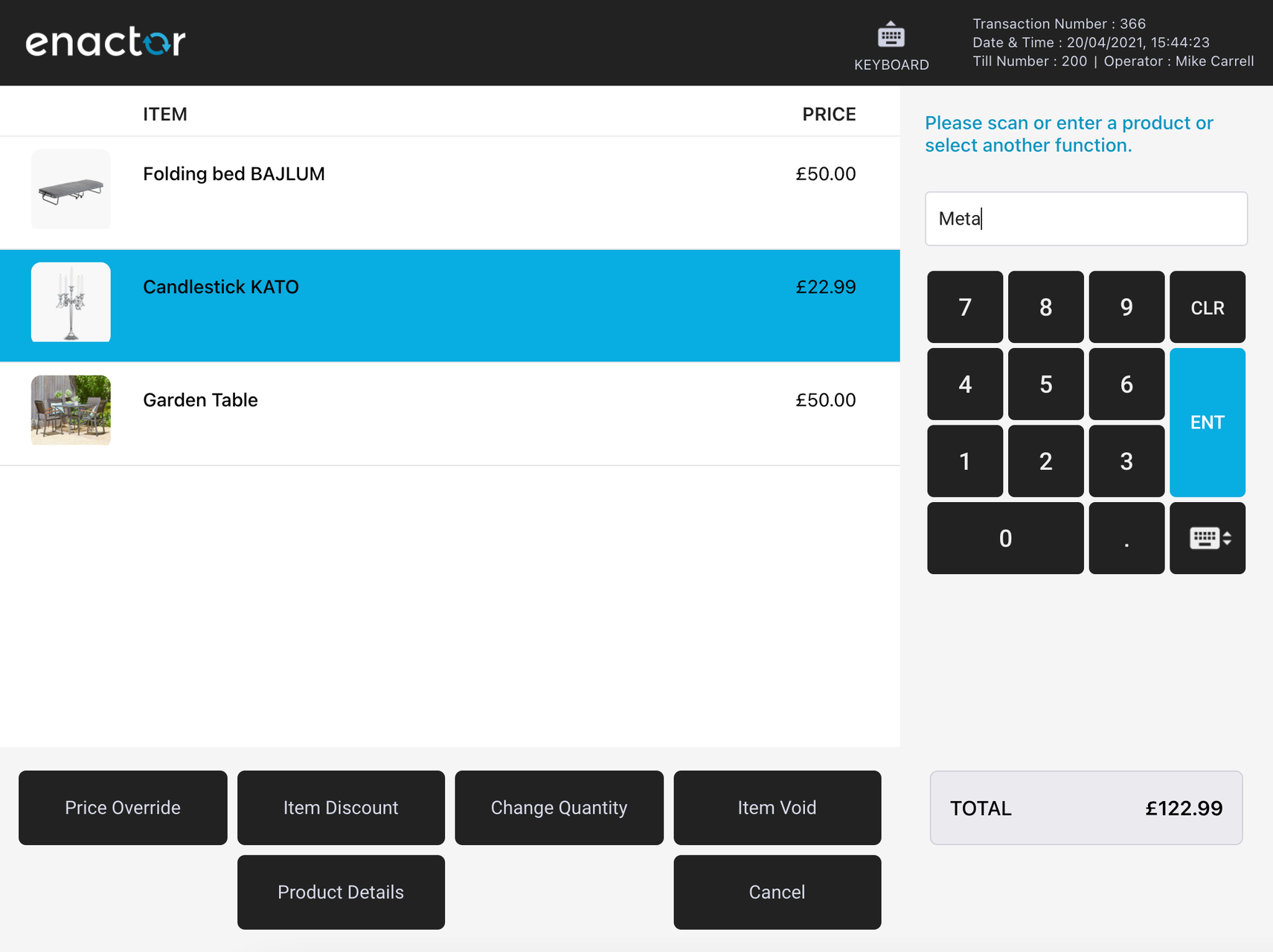
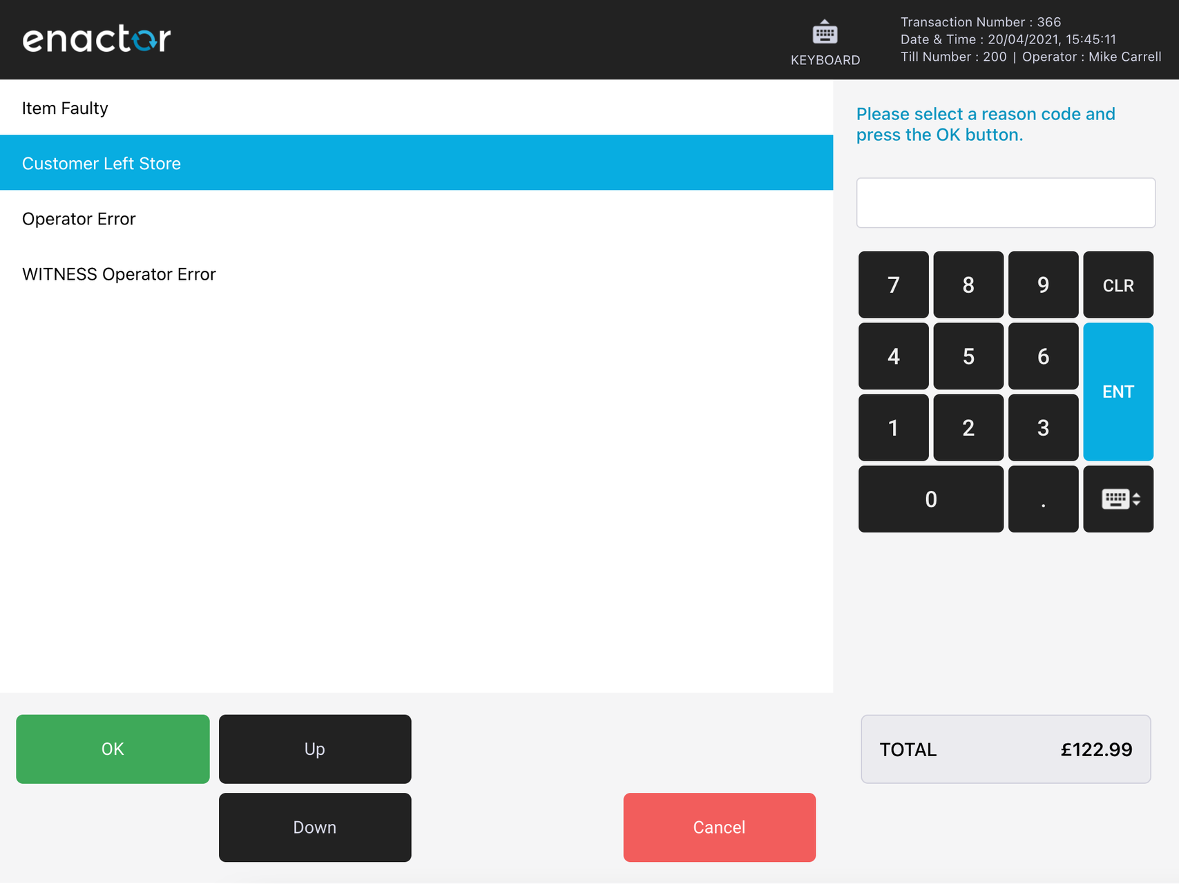
Customising UI Sections
The following sections describe the CSS classes used for each area of the React POS UI. The sample CSS referenced below can be combined into a single stylesheet and loaded via Stylesheet Maintenance.
Header Styles
The following style classes control the header area.
Header
/* --------- Header ------------ */

.hdr-area {
    background-color: #222222; /* header background colour */
}

.hdr-area .hrd-icon .icon-txt {
    color: #d0d2e2; /* menu button text colour */
}

.hdr-area .hrd-info .hrd-info-row {
    color: #d0d2e2; /* info text colour */
}

/* Header button pressed */
.hdr-area .hrd-icon:active {
    background-color: #666666; /* menu button pressed colour */
}

.hdr-area .hrd-icon .item-count,
.hdr-area .m-item-count {
    background-color: #e0e620; /* item count background colour */
    color: #222222; /* item count text colour */
}
Find and replace header-related icons from the following path:
src-js/packages/@enactor/react-pos/public/images/enactor/header
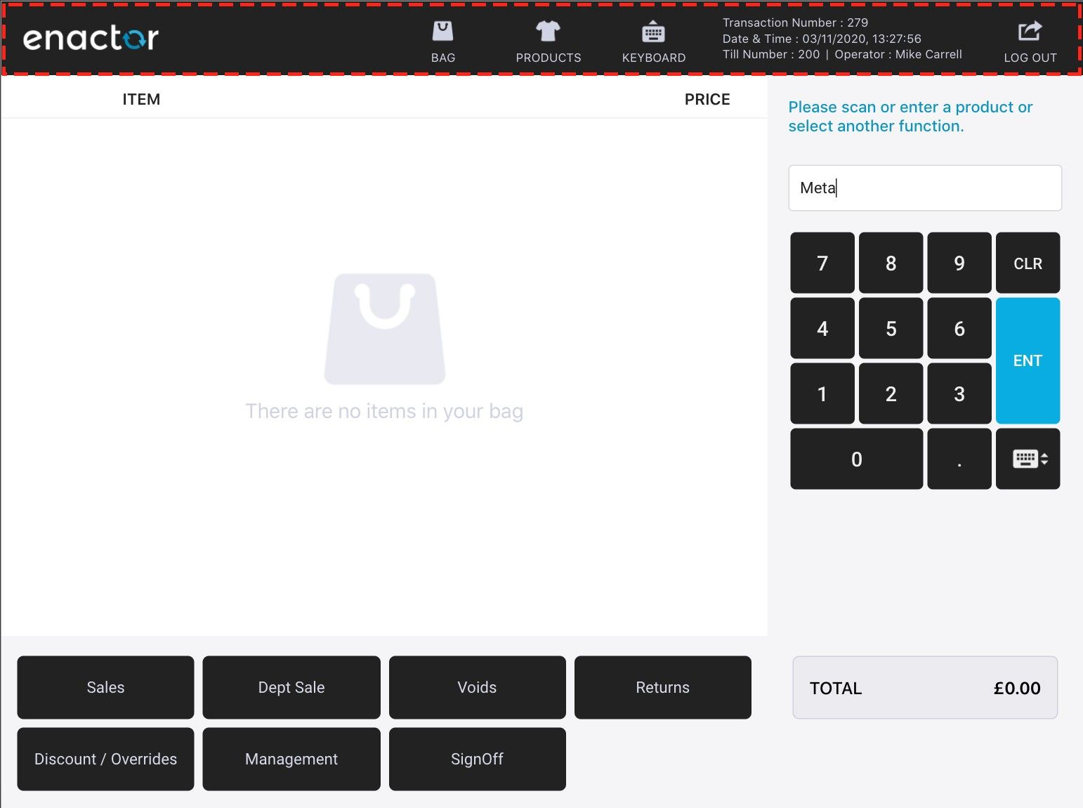
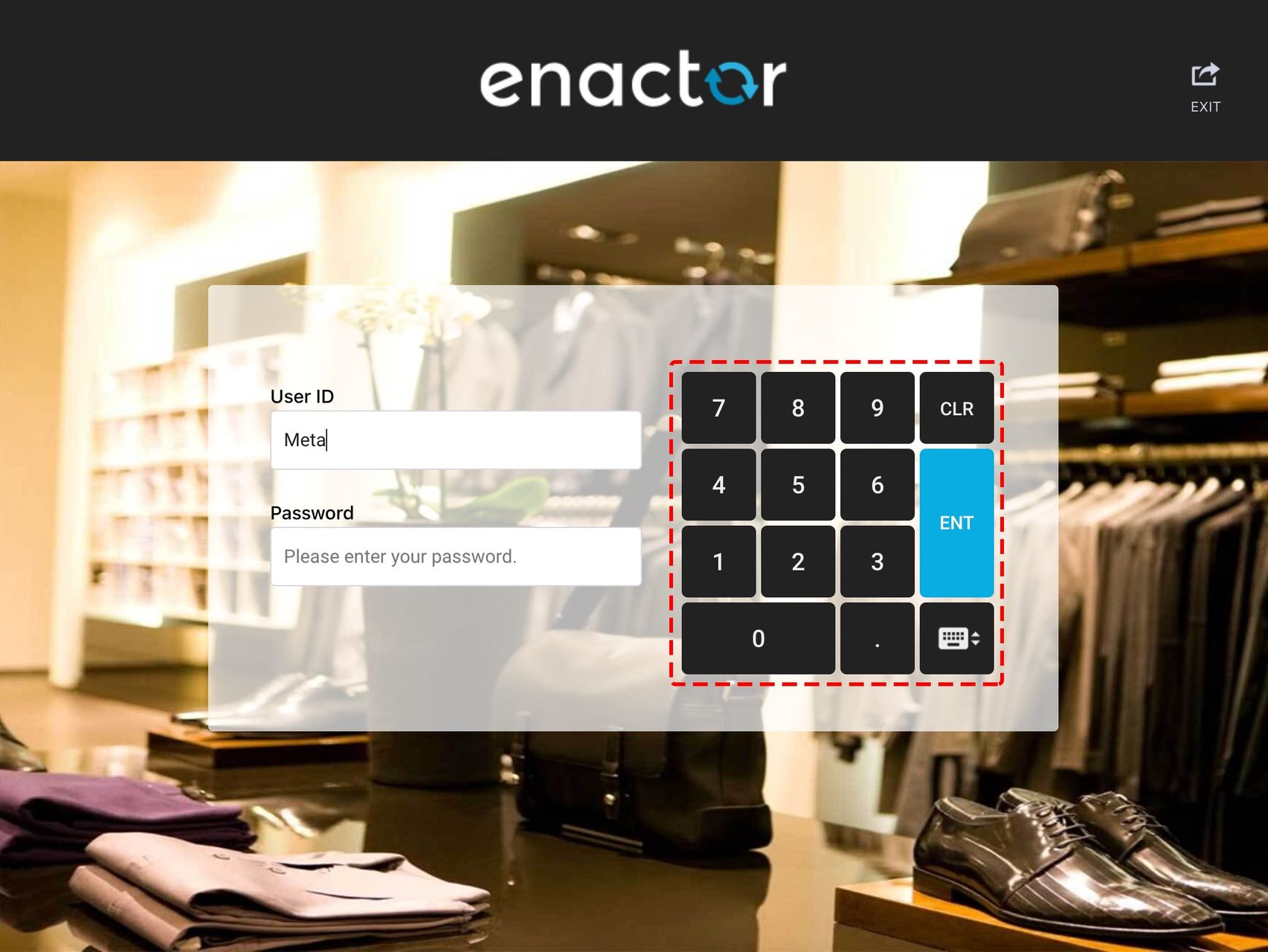
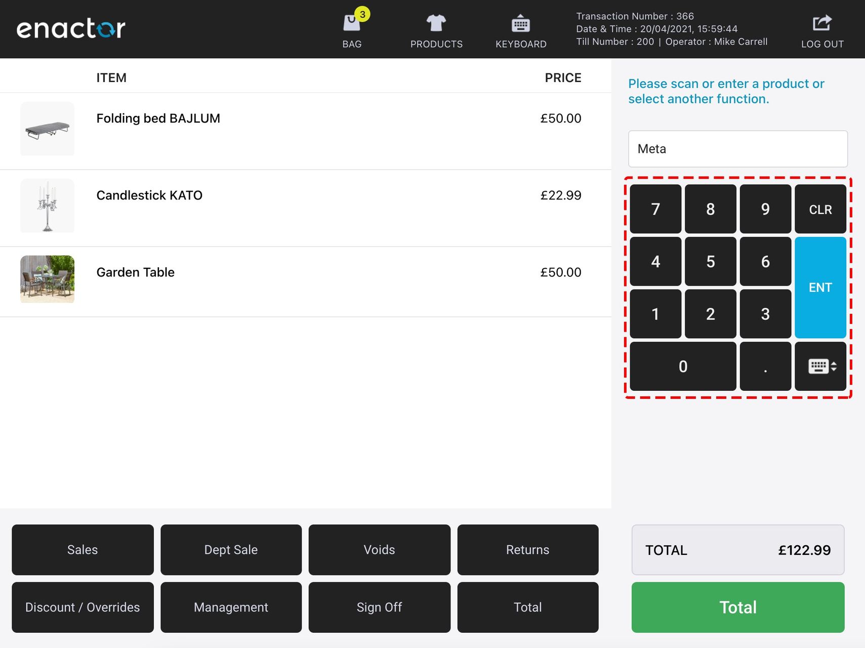
Number Pad Styles
The following style classes control the number pad area.
Number Pad
/*  --------- Number pad ------------ */

.numpad-key {
    background-color: #3C4650; /* number pad button colour */
    color: #eee; /* button text colour */
}

.numpad-key:active {
    background-color: #333D44; /* number pad button pressed colour */
    color: #eee; /* number pad button pressed text colour */
}

/* number pad enter button */
.numpad-key.enter {
    background-color: #2EB2AA;
    color: #ffffff;
}

.numpad-key.enter:active {
    background-color: #289389;
    color: #ffffff;
}

/* number pad clear button */
.numpad-key.clear {
    background-color: #E60B15;
}

.numpad-key.clear:active {
    background-color: #BC0412;
}
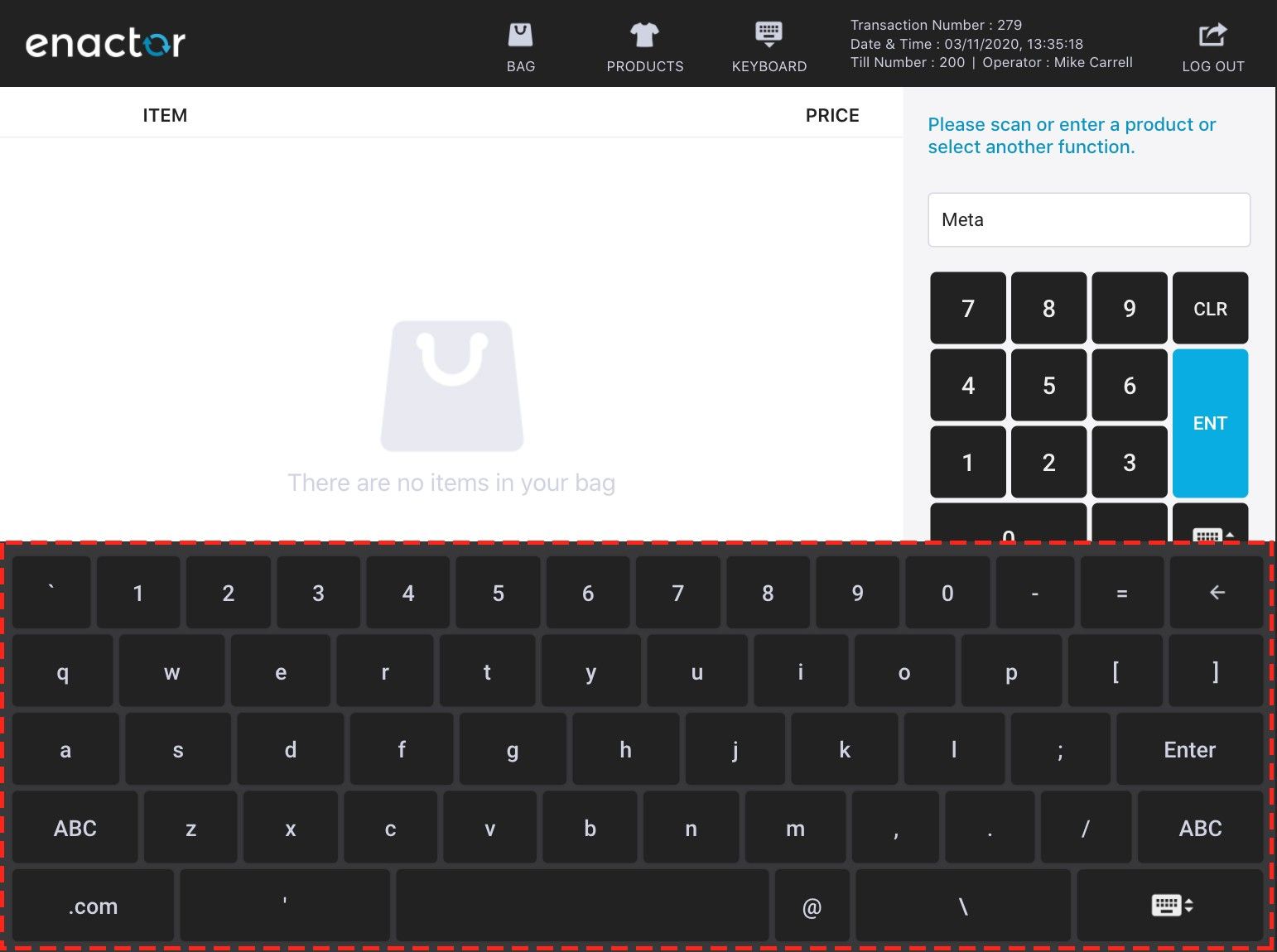
Keyboard Styles
The following style classes control the on-screen keyboard.
Keyboard
/* --------- Keyboard ------------ */

.simple-keyboard.hg-theme-default {
    background: #38383a; /* keyboard panel colour */
}

.simple-keyboard.hg-theme-default .hg-button {
    background-color: #222222; /* keyboard button colour */
    color: #d0d2e2; /* keyboard button text colour */
}

.hg-theme-default .hg-button:active {
    background-color: #666666; /* keyboard button pressed colour */
}
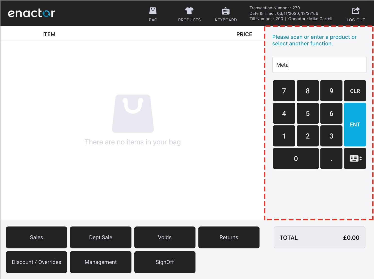
Right Panel Styles
The following style classes control the right panel area.
Right Panel
/* --------- Right Panel ------------ */

.body-right {
    background-color: #F0F0F0; /* right panel background colour */
}

.msg-wrp {
    color: #0b95c0; /* right panel message text colour */
}
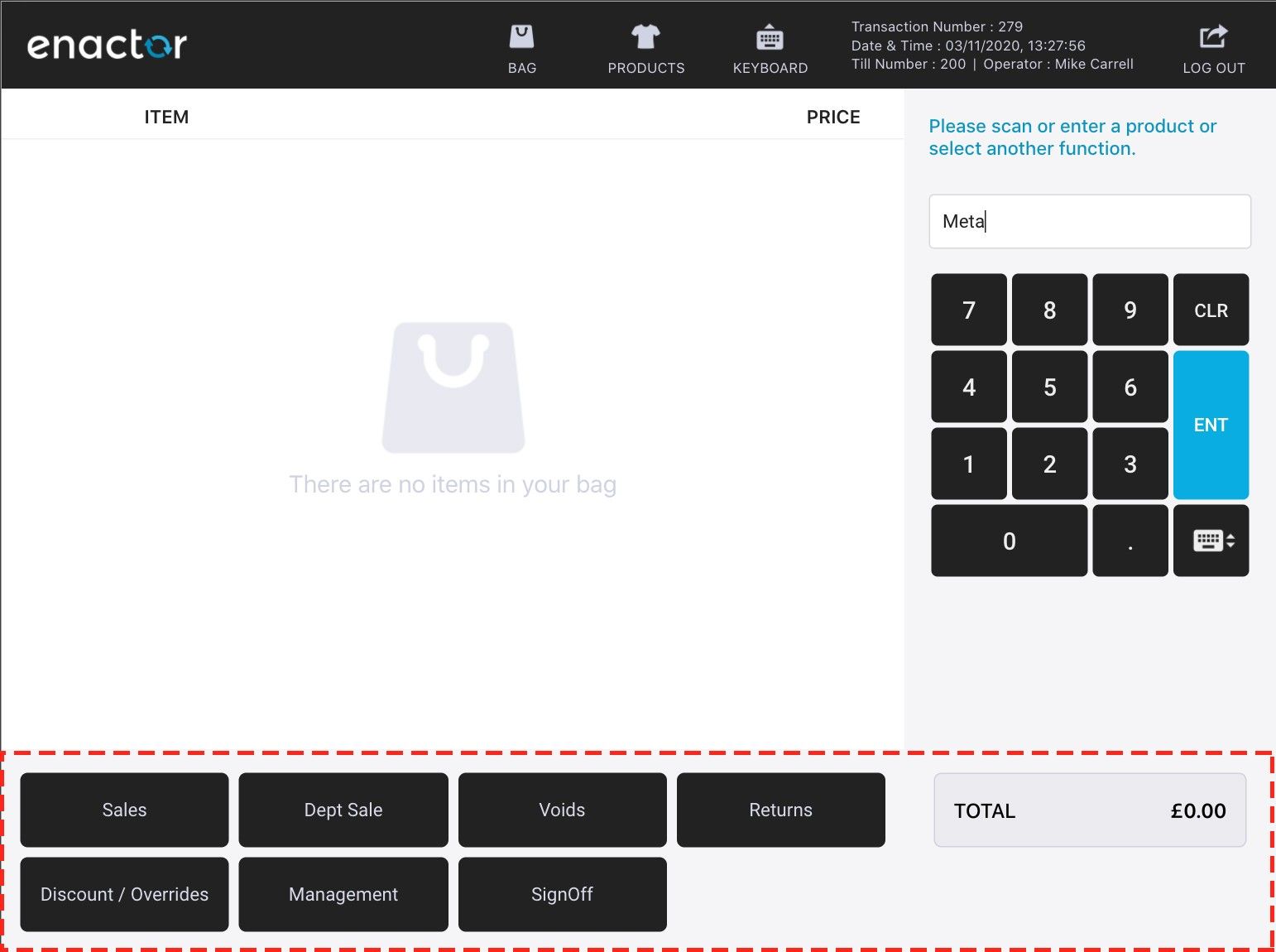
Footer Styles
The following style classes control the footer area.
Footer
/* --------- Footer ------------ */

.body-footer {
    background-color: #F0F0F0; /* footer background colour */
}

/* footer button */
.ftr-button {
    background-color: #222222;
    color: #d8dae9;
}

/* footer button pressed */
.ftr-button:active {
    background-color: #666666;
    color: #d0d2e2;
}

/* footer ok/continue button */
.ftr-button.ok, .ftr-button.continue {
    background-color: #08ade1;
    color: #ffffff;
}

.ftr-button.ok:active, .ftr-button.continue:active {
    background-color: #289389;
    color: #ffffff;
}

/* footer cancel button */
.ftr-button.cancel {
    background-color: #f25c5c;
    color: #ffffff;
}

.ftr-button.cancel:active {
    background-color: #d14f4f;
    color: #ffffff;
}

/* total button */
.ftr-button.total {
    background-color: #3ea958;
}

.ftr-button.total:active {
    background-color: #2f8845;
}

/* total display label */
.tot-lbl {
    background-color: #ebebef;
}

.tot-lbl-txt1, .tot-lbl-txt2 {
    color: #222222;
}
Row Selected Styles
The following style classes control the selected row highlighting.
Row Selected
/* --------- Item/Row Selected Style ------------ */

.basket-grid-row.selected, .selection-row.selected {
    background-color: #2EB2AA;
    color: #ffffff;
}
Button Styles
The following style classes control the general button appearance.
Button
/* --------- Button Style ------------ */

.btn-green, .popup-ftr-btn.btn-green {
    background-color: #2EB2AA;
    color: #ffffff;
}

.btn-green:active, .popup-ftr-btn.btn-green:active {
    background-color: #289389;
    color: #ffffff;
}

.btn-red,
.popup-ftr-btn.btn-red {
    background-color: #E60B15;
    color: #ffffff;
}

.btn-red:active,
.popup-ftr-btn.btn-red:active {
    background-color: #BC0412;
    color: #ffffff;
}
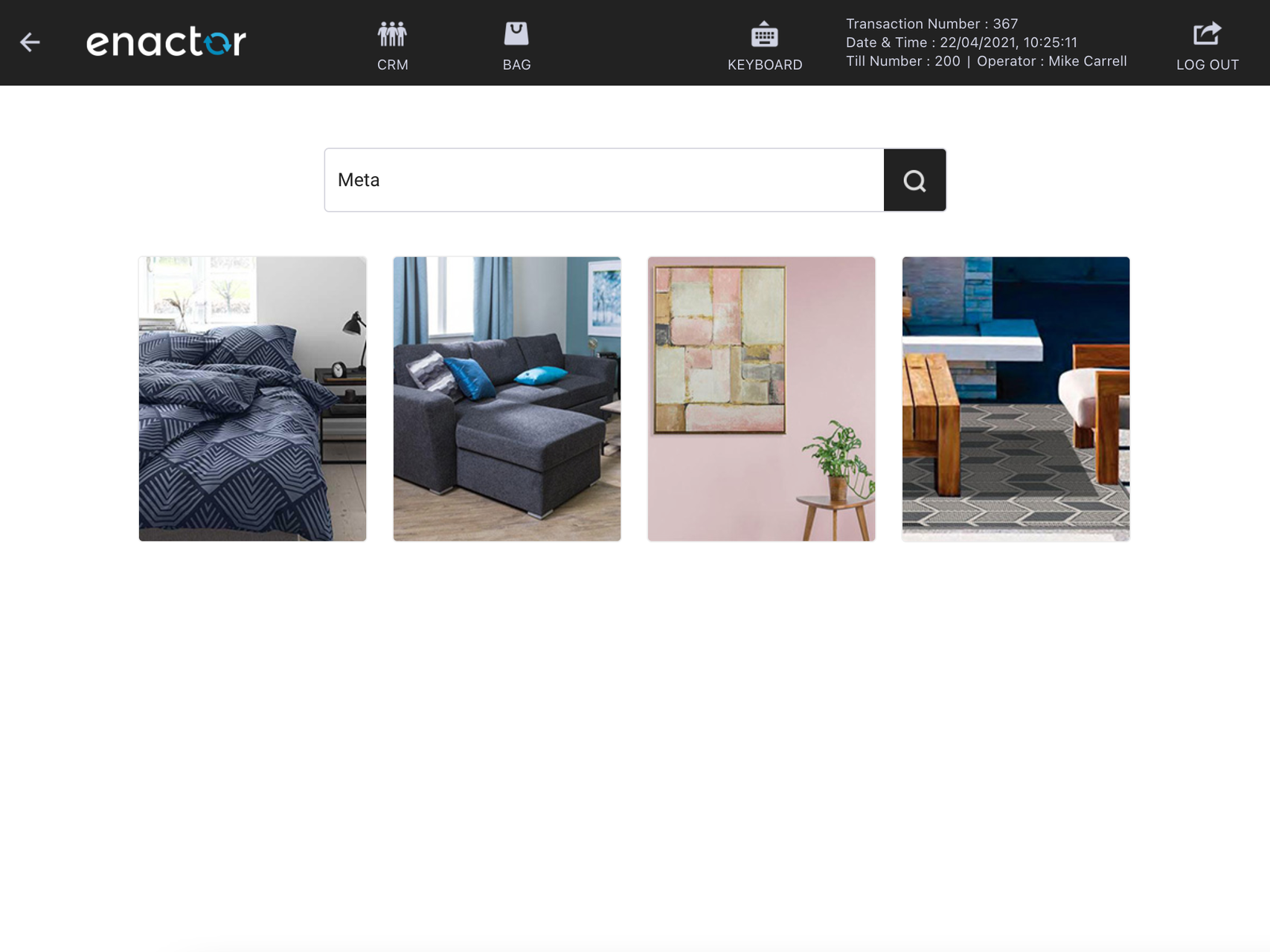
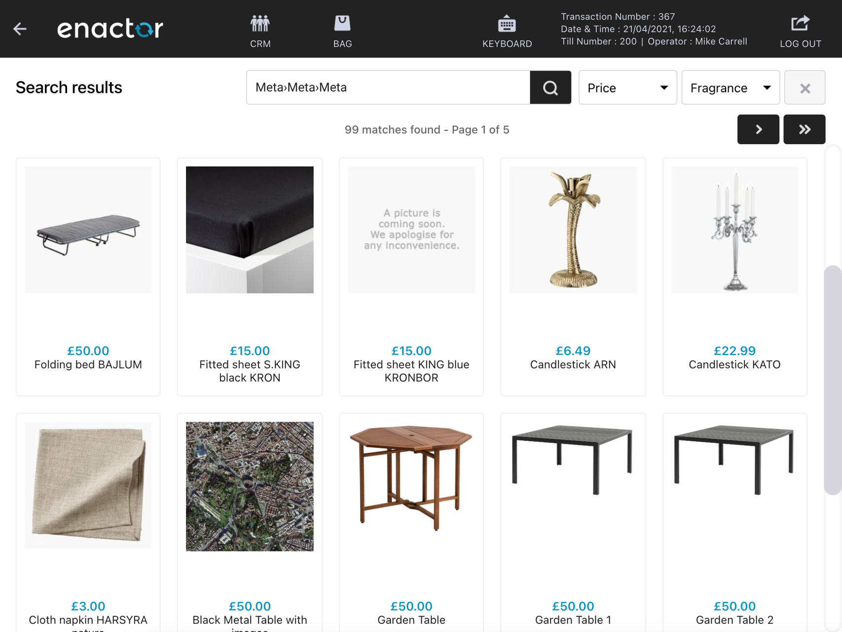
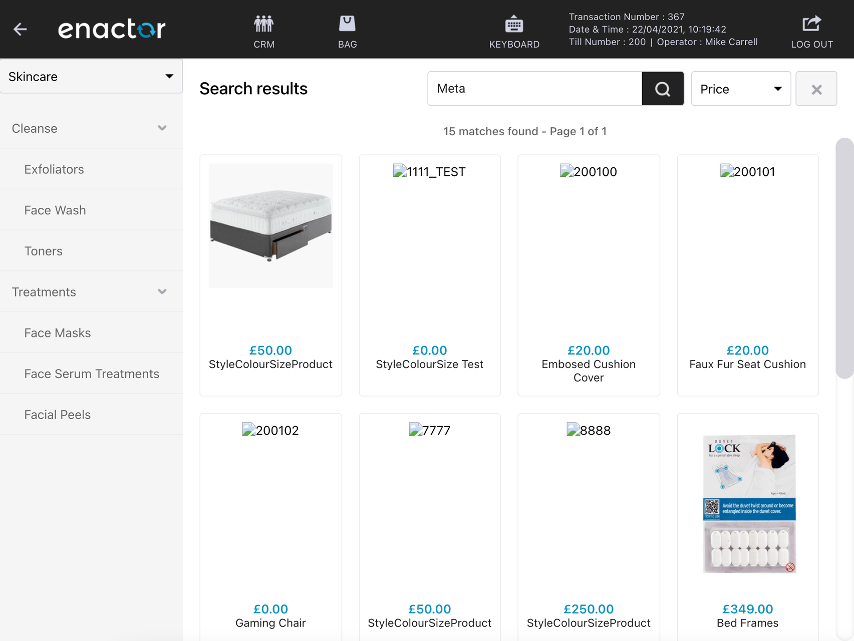
Rich Product Search
Product Search and Product Listing
The following style classes control the product search and listing area.
Product Search
/* --------- Product Search ------------ */

.pro-hdr-search-btn, .paginbtn {
    background-color: #0050AA;
}

.pro-hdr-search-btn:active, .paginbtn:active {
    background-color: #004787;
}

.product-left {
    background-color: #f5f5f6;
}

.sidenav > ul > li > a,
.sidenav a {
    color: #666666;
}
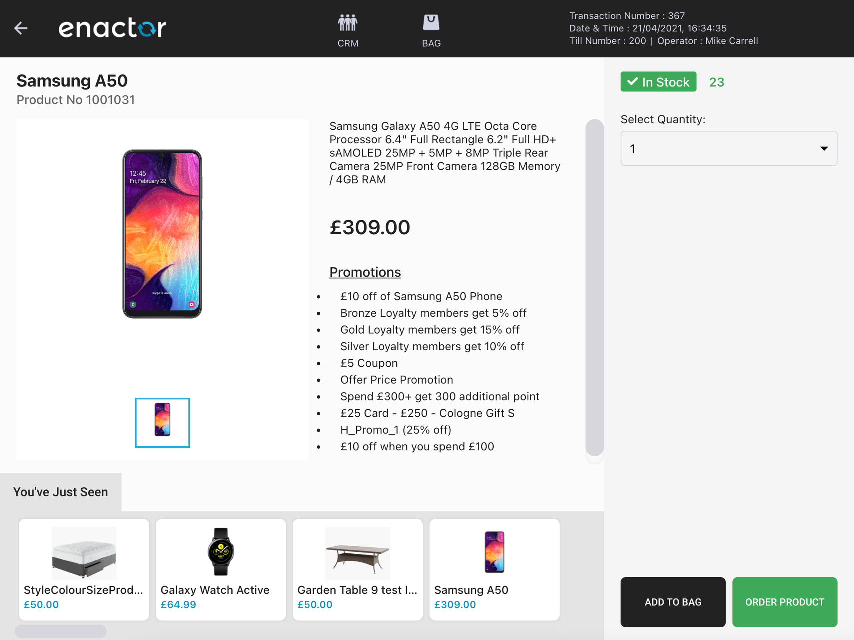
Product Detail View Styles
The following style classes control the product detail view.
Product Detail View
/* --------- Product Item ------------ */

.product-availability {
    background-color: #f25c5c;
}

.instock .product-availability {
    background-color: #3ea958;
}

.product-stock-count {
    color: #3ea958;
}

/* add to bag button */
.sidepanel-ftr-btn.half {
    background-color: #222222;
    color: #ffffff;
}

/* order button */
.sidepanel-ftr-btn.half.green {
    background-color: #3ea958;
    color: #ffffff;
}

.sidepanel-ftr-btn.half.green:active {
    background-color: #2f8845;
}
Fonts
Applying a New Font
The following style class controls the font used across the POS UI.
Fonts
/* --------- Font ------------ */

body {
    font-family: 'Roboto', sans-serif;
}
To use a custom font, ensure the font files are available to the POS application. Web fonts (such as Google Fonts) can be imported via a CSS @import rule at the top of your stylesheet, or the font files can be hosted locally and referenced with @font-face.