How-to Guide - Configuring POS Themes and Styles
Introduction
The purpose of this guide is to demonstrate how to configure Themes and other Styling components, enabling users to style the Enactor POS application according to their organization's branding requirements.
There are two approaches to managing the styling on the POS. The first uses Style Sheets and images which are uploaded and configured using the Estate Manager and are then broadcast to the POS as for normal configuration data.
The second approach uses custom "Themes" that are deployed onto the POS as part of a custom POS installation.
This how-to guide will cover both approaches.
Overview
The following steps are required to configure POS Styles and Themes:
- Style Sheet Configuration
- Image Category Configuration
- Image Configuration
- POS Terminal Configuration (Style Sheets and Images)
- Theme Configuration
- POS Terminal Configuration (Themes)
- Rich Product Search Menu Configuration
Prerequisites
Resources
Before starting, user should have the following resources in place:
- Enactor Estate Manager
- Enactor POS (configured within the UK Region, connected to the Estate Manager)
- Standard Configuration, including:
- Base Configuration
- UK Retail (UK is used in this example, but it could be other regional config packs.)
- Examples of Data to be used as models, particularly product data
Prior Training/Experience
User should have successfully completed the Introduction to Enactor course.
Configuration Steps
Style Sheet Configuration
The Style Sheet is a document containing the rules for how the POS application should appear, including fonts, colours and images. It is combined with a set of templates that define the structure of the POS Pages, and a set of images, to provide the final User Interface design:

The Style Sheet may be maintained using standard CSS editing tools and techniques. An existing Style Sheet should be used as a model, to ensure all the required styles are included.
The main components of the Style Sheet that will be maintained comprise:
- Colours - entered as hexadecimal RGB codes, e.g.,
#FF3344:

- Images - these use a standard URL Structure e.g.,
image://ImageCategory/Button40x40.png- This URL relates to the images and image categories that have been created/uploaded for this POS UI
- Fonts - these normally come from the template, but may be overridden with the Style Sheet
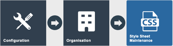
To configure a Style Sheet, navigate to the Maintenance utility in the Estate Manager using search or the path:
Configuration > Organisation > Style Sheet Maintenance
Click the Create Style Sheet button to create a new Style Sheet.
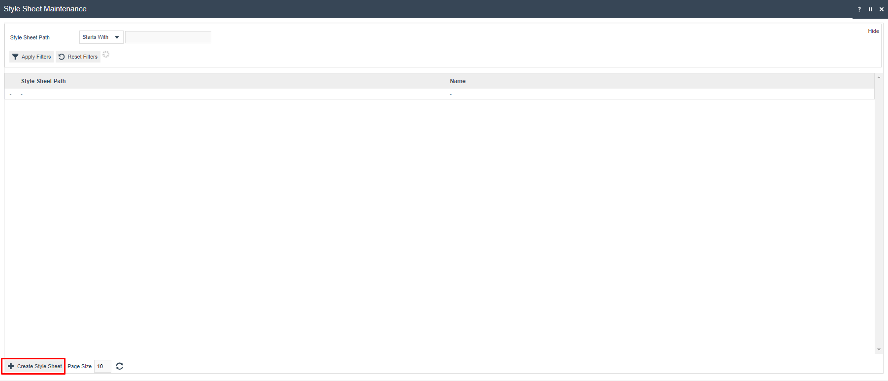
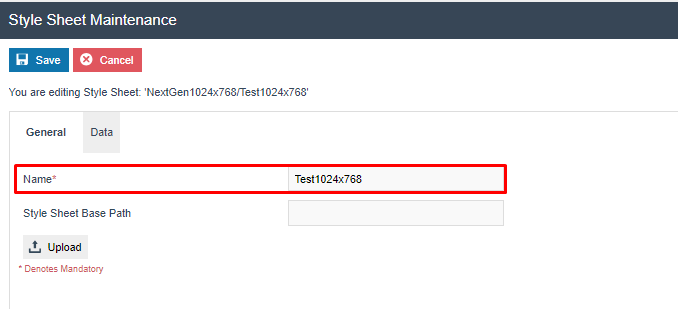
Enter the Path of the Style Sheet. This will be a path structure based on an existing Enactor POS theme. For example, a Style Sheet that is a child of the Enactor NextGen1024x768 theme may have the path "NextGen1024x768/Test1024x768".

On the next page, enter a Name for the Style Sheet.
The Base Path field is not required.
Then Upload the CSS file that will be the basis of the Style Sheet. This may have been provided by Enactor or edited externally using a 3rd party tool. Click the Upload button, then browse to find the file on the filesystem. Then click Upload.
| Configuration | Description |
|---|---|
| Name | A user-friendly name for the Style Sheet, for example Test1024x768. |
| Style Sheet Base Path | Not required. Leave blank unless a specific base path is needed. |

Then navigate to the Data tab to view the CSS content. The CSS cannot be edited on this page. If editing is required, this should be done externally and the file re-uploaded.
Once the file is uploaded, Save the Style Sheet.
Once the CSS file is uploaded to an Enactor Style Sheet and saved, it is recorded internally in Enactor in XML format. This is the format used if Enactor broadcasts or exports the Style Sheet data. Do not confuse the CSS file (which may only be uploaded to Enactor using the Style Sheet maintenance utility) with the Enactor Style Sheet XML, which operates in the same way as all other Enactor master data XML entities.
This concludes Style Sheet configuration.
Image Category Configuration
Image Categories are used to classify different types of images within Enactor. Several Image Categories are provided with Enactor initially. More categories may be created to hold different sets of images for use within POS UI configurations.
As noted above, the standard image URL for each POS image contains the Image Category as a folder path.
For example, image://TestCat1024x768/Button40x40.png points to a standard-sized button image in the TestCat1024x768 folder.
When images are deployed to the filesystem on the POS (which is done automatically by the data broadcast & receive process) they will be located within folders matching the Image Categories.
To configure Image Categories, navigate to the maintenance utility using Search or the path:
Configuration > Media > Image Categories

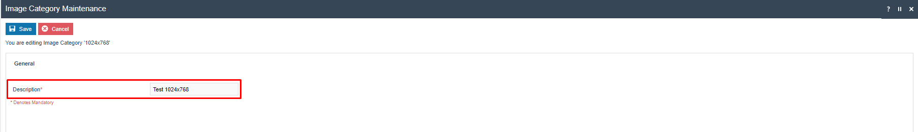
To create a new category, click on Create a new Image Category.

Give the Category an appropriate ID. Often this will include the resolution of the UI (e.g., 1024x768, 1920x1080) so it is clear to which scale the images in the category relate.

Then give the Category an appropriate name and save.
| Configuration | Description |
|---|---|
| Category | A unique identifier for the category. Include the UI resolution (e.g. 1024x768, 1920x1080) to indicate which scale the images relate to. |
| Description | A user-friendly name for the category, for example Test 1024x768. |
This concludes Image Category configuration.
Image Configuration
Images required for the User Interface can be uploaded. The Images will each belong to an Image Category and will be referenced in the Style Sheet.
To create the image records, navigate to Image Maintenance using Search or the path:
Configuration > Media > Images

The Image maintenance utility is used to manage several categories of images, including those used for products, receipt logos etc.
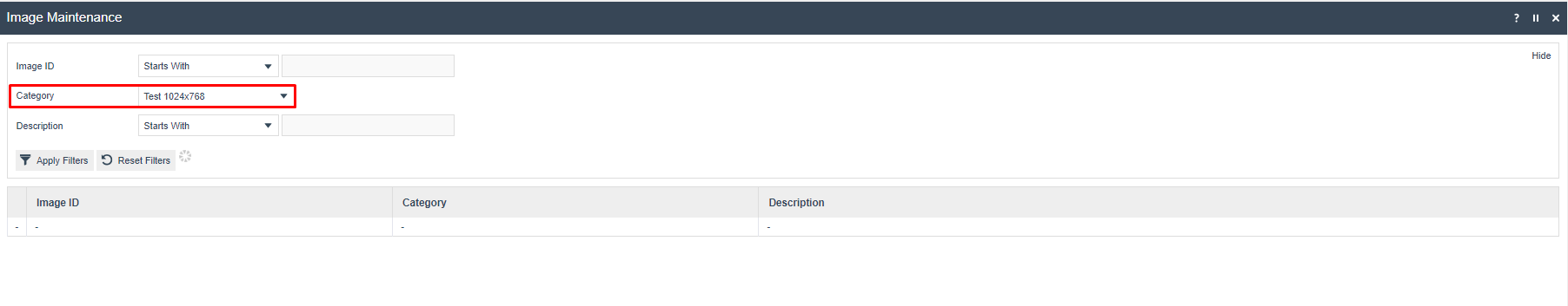
The user starts by selecting the Image Category created from the dropdown. The customer will then be presented with an empty list as no images have been created for this category yet.
Start a new image by clicking Upload a new image.
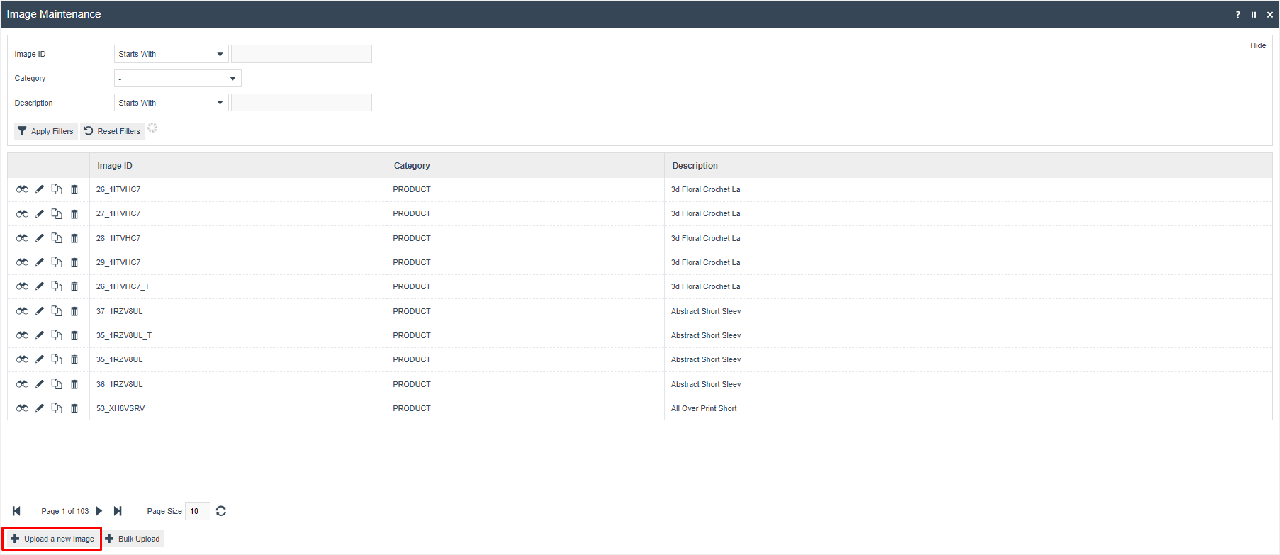
The Category should be preset to the image category chosen. The image ID is given the name of the file, excluding the extension. For example, if the file is named testimage.png, the image ID would be testimage.
In this example, a background image will be uploaded.

Give the image an appropriate description. Then click on Upload Image and browse to find the image file on the local filesystem.
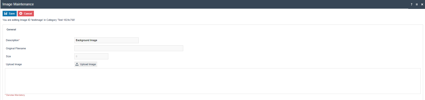
| Configuration | Description |
|---|---|
| Category | The Image Category to which this image belongs. Pre-populated from the category filter. |
| Image ID | The filename of the image, excluding the extension (e.g. for testimage.png, enter testimage). Used in Style Sheet image URL references. |
| Description | A user-friendly description of the image, for example Background Image. |
| Upload Image | Click to browse to and upload the image file from the local filesystem. |
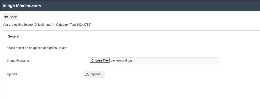
Then click Upload to load the file into the Estate Manager.
The utility will show a preview of the image, and the filename and size will be populated. Save the image record.

Then repeat this process for all the images required by user's Style Sheet.
This concludes the image configuration step.
POS Terminal Configuration (Style Sheets and Images)
The final configuration step is to apply the Style Sheet that was configured to the selected POS Terminals/POS Terminal Templates. This will then make the changes effective.
Navigate to POS Terminal Configuration using Search or the path:
Configuration > Organisation > POS Terminal Templates
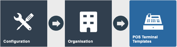
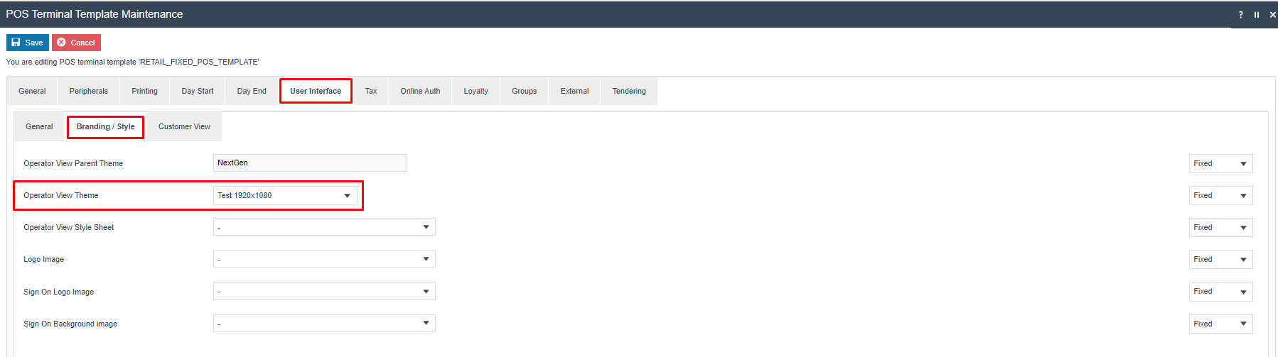
Then select the POS Terminal/Template to be modified and click on edit.
Then switch to the User Interface Tab, and the Branding/Style sub-tab:
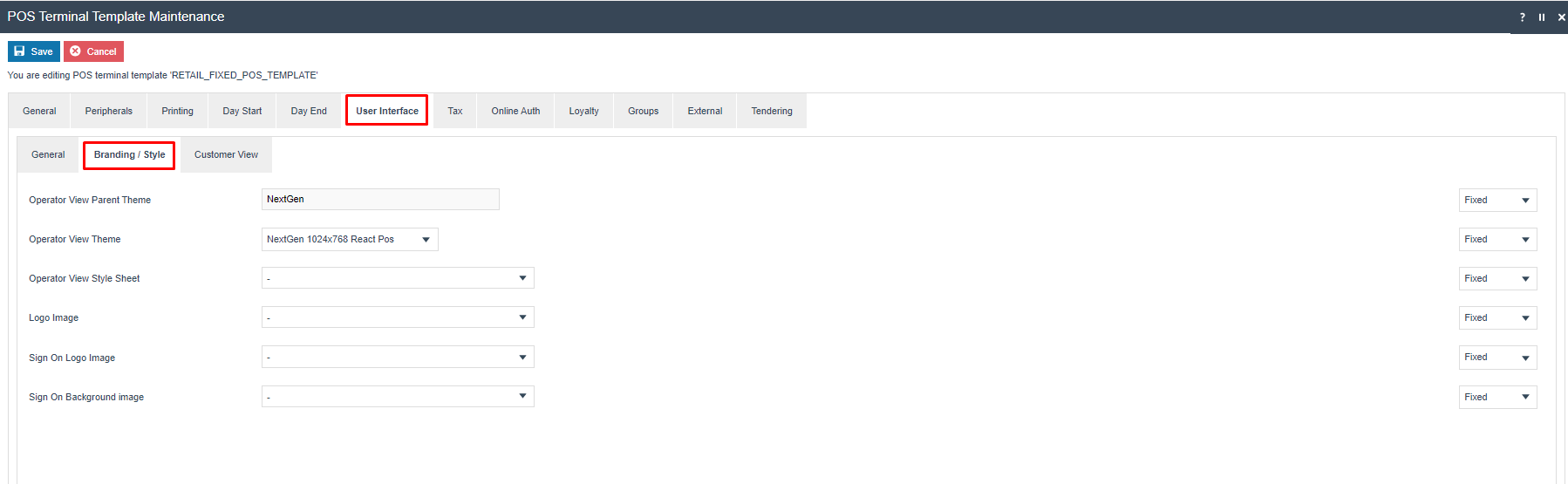
The Operator View Theme should be set to the parent theme of which the Style Sheet is a child theme. (see Style Sheet maintenance above for reference).
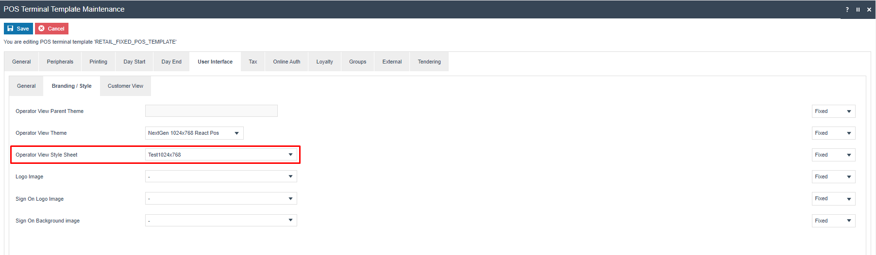
Then select the Operator View Style Sheet drop-down. Select the configured Style Sheet name from the list.
| Configuration | Description |
|---|---|
| Operator View Parent Theme | The parent theme of which the Style Sheet is a child. Set this to match the parent path used when creating the Style Sheet (see Style Sheet maintenance above). |
| Operator View Theme | The specific theme variant to use for the POS UI layout and structure. |
| Operator View Style Sheet | Select the configured Style Sheet name from the dropdown. |
| Logo Image | Optional. Select a configured image to display as the logo on the POS. |
| Sign On Logo Image | Optional. Select a configured image to display on the POS sign-on screen. |
| Sign On Background Image | Optional. Select a configured image to use as the background on the POS sign-on screen. |
Save the POS Terminal/POS Terminal Template.
This concludes the POS Terminal configuration Step. All the configuration required to set the Styling of the POS UI is now complete. Broadcast all the amended entities to your target POS Device(s). Once they have been received, restart the POS application.
The reconfigured POS user interface should be displayed.
This completes the POS Terminal configuration for Style Sheets and Images.
Theme Configuration
The alternative approach to POS UI configuration is to use a Theme. This theme will have been developed, either by Enactor, a partner, or an in-house development team. The Theme will be installed on the POS along with the rest of the POS application. It will then need to be configured, to ensure the POS devices use the appropriate theme(s).
The development team will provide a Theme xml file. This should be uploaded to the Estate Manager using the File Importer.
Once the Theme xml has been imported, it should then appear in the Theme Maintenance utility. Navigate to Theme Maintenance using Search or the path:
Configuration > Organisation > Theme
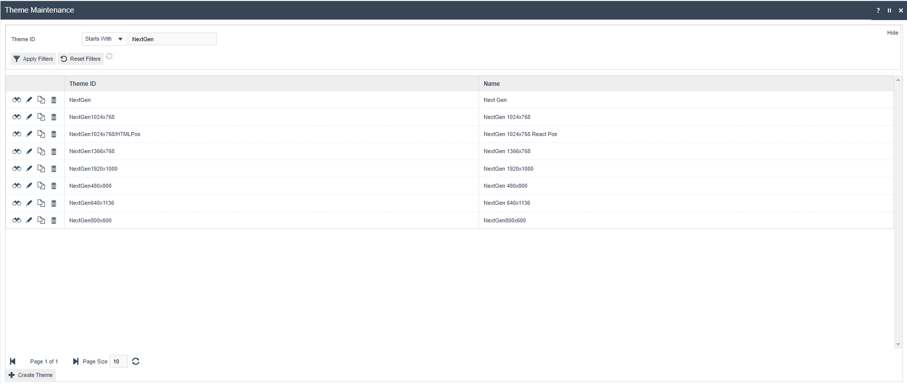
To review the theme, click on view or edit. The Page Definition tab lists all the Page Definitions that are included in the Theme. This should not normally be amended.
This concludes Theme configuration.
POS Terminal Configuration (Themes)
Once the Theme has been uploaded and checked, it may be assigned to the appropriate POS Terminals/POS Terminal Templates. This will then make the changes effective.
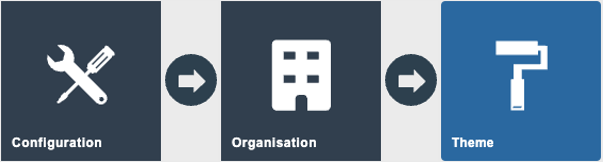
Navigate to POS Terminal Configuration using Search or the path:
Configuration > Organisation > POS Terminal Templates

Then select the POS Terminal/Template to be modified and click on edit.
Then switch to the User Interface Tab, and the Branding/Style sub-tab:
The Operator View Theme should be set to the name of the Theme that has been uploaded:
| Configuration | Description |
|---|---|
| Operator View Theme | Set to the name of the imported Theme. The Theme includes all page definitions and must be installed on the POS device as part of the POS application. |
Once this has been set, save the POS Terminal/POS Terminal Template.
This concludes the POS Terminal configuration Step. All the configuration required to set the Styling of the POS UI is now complete.
This completes the POS Terminal configuration for Themes.
Broadcasting
To deliver the configuration changes to the POS, broadcast the following entities:
- POS Terminal
- Images
- Themes
- Style Sheet
Once they have been received, restart the POS application.
This completes the Broadcasting configuration.