How to Customize React POS
Introduction
Please consider the customer name provided when creating the templated customer projects when you see Template Customer / Template / template-customer terms in this documentation.
This document will describe the basic components available to compose a new component or a new prompt in the customer's react pos project (Template Customer - React Pos). There are five enactor packages made available to the customer’s react pos project as npm dependencies. You can see them in your package.json file as below.
- @enactor/react-base-components
- @enactor/react-pos - React screens for prompts in platform reside inside this package
- @enactor/react-javascript-bridge
- @enactor/redux-javascript-bridge
- @enactor/javascript-bridge
Only some of the components (mostly used or important) importable from the above packages will be discussed here. Adding a prompt route and overriding an existing component will be explained at the end of this document.
Navigate to the src directory in any of the above packages in node_modues/@enactor path to see the source code.
Available react base components
Inputs
ConnectedTextInput
This is the input component you should be using when the user can enter text in a form or in the prompt input. This component actually uses the HTML <input> and HTML <textarea> at the core with added functionalities. A text input looks like this.

Refer to the following code snippet as an example ConnectedTextInput component.
<ConnectedTextInput
    promptUrl={promptUrl}
    name={"forename"}
    test-component-id="NamePrompt.ForenameField"
    className="ctmrd-input"
    displayError={isSubmitted}
    onValidationUpdate={this.onValidationUpdate}
    validationCriteria={validationBuilder(
        SUPPORTED_TYPES.STRING
    )
        .withMax(30)
        .withMin(1)
        .required()
        .getCriteria()}
/>
Supported props
-
name - Name of the input filed. This will be set to name prop of HTML
<input>filed.name="forename"
-
textType - Value can either be “text” or “password“. Default value is “text”.
textType="password"
-
defaultValue - default value for the text input to have.
defaultValue="abcd"
-
placeholder - Same as the HTML input prop called placeholder.
placeholder="Enter password"
-
className - You can add custom styles by defining a class name. This will be set to className prop of HTML
<input>filed.className="ctmrd-input"
-
isTextArea - pass this prop if you need a
HTML <textarea>instead ofHTML <input>. default is theHTML <input>. With this prop set, the input renders as below.isTextArea

-
numberOfRows - This is the number of rows available for the text area.
numberOfRows={23}
-
isDisabled - Pass this prop to make the input as disabled. This will function the same as the HTML default prop for the input tag. In the example below, it is using
className="ctmrd-input"as the css styles to indicate it is disabled.isDisabled

-
onBlurCallback - If you want any function to be called when you lose the focus of the input then pass your function under this prop.
onBlurCallback={loadData}
-
forceInputFocus - If you need your input component to never lose focus. Then pass this prop.
forceInputFocus
-
validationCriteria - This is the definition for the input validation. The following example refers to the textarea input shown above, which is a string input with a maximum of 4000 characters. Validation will be discussed under a separate section below. (TODO)
validationCriteria={validationBuilder(SUPPORTED_TYPES.STRING)
.withMax(4000)
.withMin(0)
.getCriteria()}
-
onValidationUpdate - This is a callback function getting called whenever the input validation happens. Callback fucntion will be called with two arguments. The first one is the name of the input which is provided under name prop and the second one the boolean status of whether the input has passed the validation.
onValidationUpdate={this.onValidationUpdate}
onValidationUpdate(name, isClean) {
   // set the local state/logic inside the component
}
-
displayError - This will turn on/off displaying the validation errors for that input. The following example will always show the validation error.
displayError={true}

-
test-component-id - This is the property you need to set for the purpose of test automation to identify the input of the prompt. This should be the same as the name provided in the swing pos application. But In React Pos this can be in a different format like
<PromptName>.<InputName>.test-component-id="CaptureCustomer.Forename"
-
formatterConfig - If you want to format the text while user is typing the input then you can use this prop. This is an array first one is the type of the formatter and the rest of the elements will depend on the type. The two examples below use a date formatter and a currency formatter.
formatterConfig={[CURRENCY_TYPE, currencyId]}- This is the config used for the currency example below. You need to provide type asCURRENCY_TYPE(can be imported from@enactor/react-base-components) and the currency ID which can be retrieved from the Redux store.formatterConfig={[DATE_TYPE]}- This is the config used for the date example below


ConnectedSelectInput
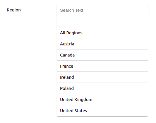
This is the input component you should be using when the user needs to select one option from a set of given options. See the example below.
Refer to the following code snippet as an example ConnectedSelectInput component.
<ConnectedSelectInput
	name={name}
	className="select-wrap filter-select"
	options={getConvertedOptions()}
	onChange={event => {
		const parsedValue = JSON.parse(event.target.value);
		const { id, groupHierarchyId } = parsedValue;
		const value = [id, groupHierarchyId].join();
		setSelectionInValueCache(promptUrl, name, event.target.value);
		sendEvent("enactor.coreUI.Filter", {
			filterIndex,
			value: value,
			regionId: id,
			groupHierarchyId: groupHierarchyId,
			type: "RegionId"
		});
	}}
/>
Supported props
-
name - Name of the select input filed.
name="region"
-
className - You can add custom styles by defining a class name.
className="select-wrap"
-
options - This is the list of options the user can select from. This is an array of JSON where each item should be in the following format. You might need to convert your list data to the following format if it is not.
-
{data: { description: <display_name> }, // this will be the value that user sees as an optionkey: <key_of_the_item> // stringify the key if it is already and JSON. This will be set as the option value.// This value will be availble from the event.target.value where event is the first argument in// onChange callback}
options={convertedOptionsList}
-
-
onChange - A callback function that gets called when the user selects an option from the available options. It will receive the event as the first argument. Consider the following as an example
-
handleSelectionChange = (event) => {// event.target.value will be the key you set in the options list// if the options has a key that was stringified then it can be parsed like below// const parsedValue = JSON.parse(event.target.value);// you can set the selection state to a local state or send it like below// sendEvent("filter", { <data_name>: event.target.value or parsedValue[<some_value>] });// sendEvent action can be accessed using defaultMapDispatchToProps in @enactor/react-base-components package}
onChange={handleSelectionChange}
-
ConnectedCheckboxInput (Toggle Button)
This is the input component you should be using when the user needs to select true/false for a selection. The first example below shows the false state, the second the true state.
Refer to the following code snippet as an example ConnectedCheckboxInput component.
<ConnectedCheckboxInput
    name={NAME}
    isSmall
/>
Supported props
-
name - Name of the input filed. This will be set to name prop of HTML
<input>filed.name="excluded"
-
isSmall - If you need to have a smaller version(in size) toggle button then pass this prop.
isSmall
-
onChange - This is simlar to the onChange prop in ConnectedSelectInput.
-
isDisabled - Pass this prop if you need to have a disabled toggle check box inpu. See the disabled example below.
You can retrieve the current value of the selection state(true/false) using valueCache like below.
const valueCache = getValueCache(state, promptUrl); // you can import getValueCache from @enactor/react-base-components
const { excluded } = valueCache;                    // pass the value("excluded) as a prop to the component you need


Do not use HTML <input>, HTML <textarea>, HTML <select> and HTML <option> as input components.
Always use ConnectedTextInput, ConnectedSelectInput, or ConnectedCheckboxInput.
Buttons
There are few types of buttons you can use when implementing the menu footer of a prompt. See the example of footer menu buttons below.
These buttons have been implemented as wrappers to EventButton and MenuButton in BaseComponentsFactory. You can create these buttons as in the below code snippet. You can define any other form of the buttons starting from these button components.
   import { BaseComponentsFactory } from "@enactor/react-base-components";
   const { EventButton, MenuButton } = BaseComponentsFactory.getComponents();


DefaultButton
The “Clear Address” button in the footer menu above has been implemented using this component. Given code snippet refers to that button.
  <DefaultButton
      eventHandlers={eventHandlers}
      value="ClearAddress"
      position="2"
  >
      <ResolvableMessage
          messageBase={messageBase}
          messageId="ADDRESS_BUTTON_CLEAR_ADDRESS"
      />
  </DefaultButton>
ResolvableMessage component will be explained later it will return a string to be displayed as the button label.
supported props
-
eventHandlers - This is a required prop that is used for sending events to the prompt states in application processes.
eventHandlerscan be retrieved usingdefaultMapDispatchToProps. -
value - Name of the event to be sent when user clicks on the button.
value="ClearAddress"(Refer the “Clear Address” button in the footer menu above)
-
data - additional data you need to send should be set to this prop.
data={{selectedItemIndex}}
-
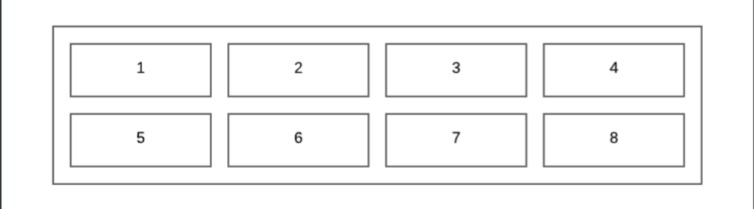
position - Position of the button in the menu. This can be any integer from 1 to 8. Refer to the menu positions below.
position="2"
OKEventButton
This menu button is almost the same as DefaultButton and it has all the props of DefaultButton. The only difference is it has a green background color and a few specific properties. Normally if the button is Yes / OK then this button should be used. See the button in position 1 of the footer menu above.
<OKEventButton
    onclick={handleSubmit}
    eventHandlers={eventHandlers}
    position="1"
>
    <ResolvableMessage
        messageBase="Pos/General/PosMessages"
        messageId="BUTTON_OK"
    />
</OKEventButton>
supported props
-
onclick - This is the callback function that gets called when the user clicks on the button. If you need to send an event when OK click event. It should be passed as a function to this prop.
onclick={handleSubmit}
CancelEventButton
This menu button is almost the same as OKEventButton. This is used as the cancel button. This button has a red background color. See the button in position 8 of the footer menu above.
<CancelEventButton eventHandlers={eventHandlers} position="8">
    <ResolvableMessage
        messageBase="Pos/General/PosMessages"
        messageId="BUTTON_CANCEL"
    />
</CancelEventButton>
UpButton/DownButton
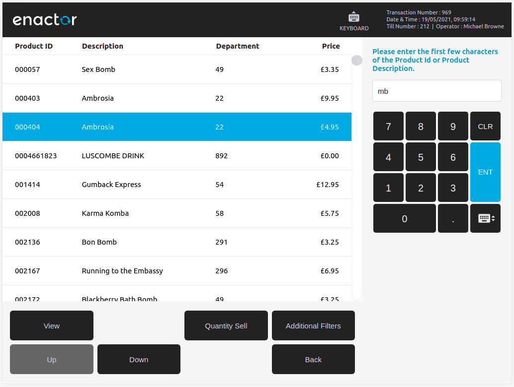
These two buttons are specifically used with selection prompts where a user needs to navigate around given entries. In the selection prompt below, it has selected the 3rd entry(in blue background) and when the user clicks on the up button once then it goes to the second entry. If the user pressed the down button instead of the up button then it will select the 4th entry in the table.
 <UpButton
    position="5"
    visibility={selectedIndex !== listBounds.minIndex}
    clickHandler={decrementSelectedIndex}
>
    <ResolvableMessage
        messageBase="Pos/General/PosMessages"
        messageId="BUTTON_UP"
    />
</UpButton>

<DownButton
    clickHandler={incrementSelectedIndex}
    position="6"
    visibility={selectedIndex !== listBounds?.maxIndex}
>
    <ResolvableMessage
        messageBase="Pos/General/PosMessages"
        messageId="BUTTON_DOWN"
    />
</DownButton>
supported props
- clickHandler - You should pass the
decrementSelectedIndexorincrementSelectedIndexfunctions defined inSelectablecomponent. These will be explained below section. (TODO) - visibility - Condition to show/hide the button. If the last item selected then it should not be shown the down button and if the first item is selected then the up button should not be shown.
TotalButton
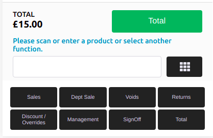
This is the green total button that appears in the basket view after adding items to the basket. This button is also defined under the menu footer area. It will be always sending Total as the event and does not accept the event as a prop. See the code snippets given below.
Fixed Pos Total button
The following component produces the Total button below.
<TotalButton eventHandlers={eventHandlers} />

Mobile Pos Total button
The following component produces the Total button below. It has been given additional styles as a prop.
<TotalButton
    eventHandlers={eventHandlers}
    className="m-basket-total-btn"
/>
Keyboard Input
There are two types of Keyboard components available in react pos. The numbered keys section to the right side of the page is the default keyboard shown for a prompt; the on-screen keyboard appears at the bottom of the page. Both are shown below.
BodyKeypad
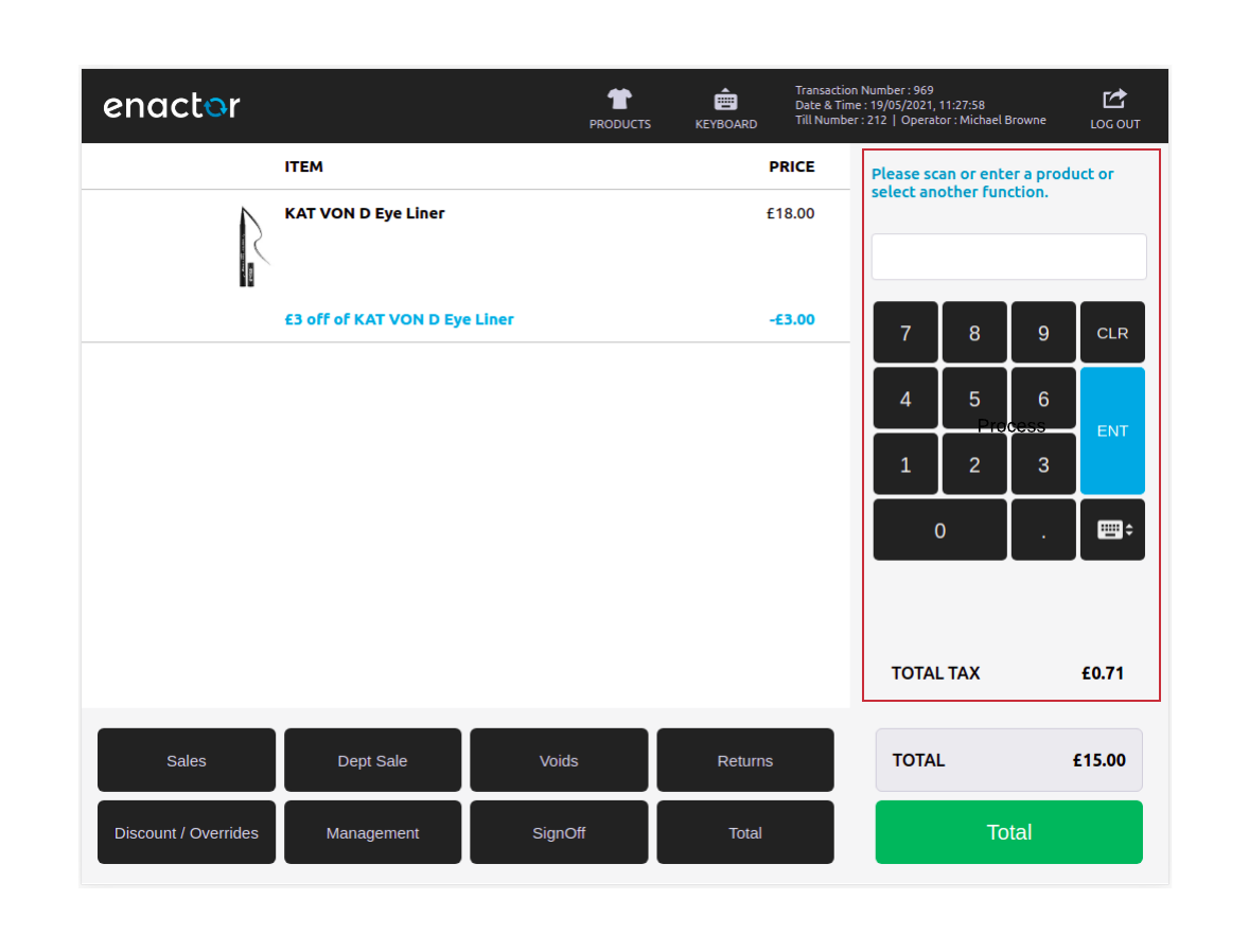
This component includes four sub-components as follows, marked by the red-colored rectangular area below.
- Prompt title - blue colored text right above the input box
- Prompt input - input box right above the keypad
- Numeric Keypad
- Tax total - right below the keypad
See the following example.
<BodyKeypad
    messageBase={<message_base>}   // message base for the prompt title
    messageId="{<message_id>}      // message id for the prompt title
    eventHandlers={eventHandlers}
/>
Supported props
-
hideInput - This will hide/show the prompt input. The default value is set to false.
hideInput
-
showKeypad - This will hide/show the keypad. The default value is set to true.
showKeypad={false}
-
forceInputFocus - If you want prompt input to be always focused. For an example where a barcode reader input is used. This prop will be passed to the
ConnectedTextInput(prompt input).forceInputFocus
-
taxTotal - This will show/hide the tax total area. The default value is set to true.
taxTotal={false}
ConnectedPosKeyboard (Toggle Keyboard)
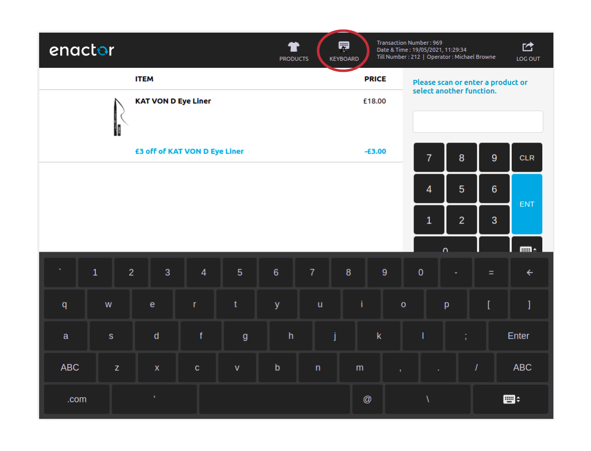
This is the on-screen keyboard in react pos. If you click on the circled button(keyboard toggle button) in the example below, It will show the keyboard. As the name says if you click again it will disappear.
Supported props
- onEnter - This is the callback function that gets called when the user types some text and click on Enter using the on-screen keyboard.
Responsive Table View
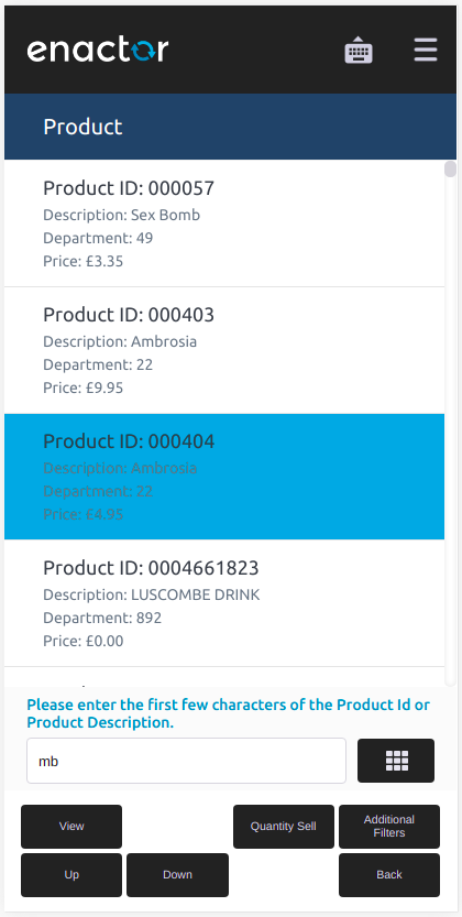
When a user is requested to do a selection in a selection prompt like the one shown earlier, this component is used to view the table. You can define column data, column header, and table title to be rendered. As the name says this component is responsive to different screen resolutions (the same prompt at mobile resolution is shown below).
Such a selectable prompt will have the following structure given in the code snippet.
import { Selectable } from "@enactor/react-base-components";
import ProductsList from "<path_to_ProductsList_component>"

class SelectProduct extends Selectable {
    render() {
       <..>
         // header component
          ...
          ...
              <ProductsList
					list={<products_list>}                             // should be retrieved from propmtData
					selectedIndex={this.state.selectedIndex}           // avalable from Selectable class
					handleSelectedChanged={this.handleSelectedChanged} // avalable from Selectable class
					className={"table-list select-products-list"}
			  />
		   ...
			// footer component
	    </..>
    }
}
Refer to the following code snippet for rendering the table area.
import { Table } from "@enactor/react-base-components";
import { MobileGridDataRow } from "@enactor/react-base-components";

const ProductsList = ({ ...props }) => {
	const columns = [...]
	const mobileLayout = {...}

    return <Table columns={columns} mobileLayout={mobileLayout} {...props} />;
};
Supported props
-
columns - This is an array that defines the columns to rendered in desktop resolution. It should define the column header and column data in the following format.
-
const columns = [{renderHeader: () => {return (<div className="basket-grid-col col-1-2"> // column specific styles (you can define any custom classes)<ResolvableMessagemessageBase={<message_base>} // message base for the column headermessageId="{<message_id>} // message id for the column header/></div>);},renderCell: data => {return (<div className="basket-grid-col col-1-2"> // column specific styles. same as the column header<div className="item-prodata">{data[<data_property>]} // which data to be shown from list entry</div></div>);}},... // add as many columns you need to show...]
-
-
mobileLayout - Content to be rendered in mobile resolution (as in the mobile example above) is provided under this prop.
-
const mobileLayout = {renderMobileHeader: () => {return (<ResolvableMessagemessageBase={<message_base>} // message base for the table headermessageId={<message_id>} // message id for the table header/>);},renderMobileCell: data => {return (<><MobileGridDataRowisMainRow // to decide the main data row. This will be shown with bolditems={[ // and larger font size (Product ID in the mobile example){headerMessageBase: {<message_base>}, // message base for the first rowheaderMessageId: {<message_id_header_one>}, // message id for the header of the first rowdataText: data[<property_one>] // data item for the first row}]}/><MobileGridDataRowitems={[{headerMessageBase: {<message_base>}, // message base for the second rowheaderMessageId: {<message_id_header_two>}, // message id for the header of the second rowdataText: data[<property_two>] // data item for the second row}]}/>.... // define as many as items you want to be shown....</>);}};
-
-
selectedIndex - Index of the currently selected item. This can be retrieved like
this.state.selectedIndexwhen you extend theSelectableas the wrapper component for the selection prompt. -
handleSelectedChanged - This is the Callback that gets called when the user clicks on an item in the table. The callback will get called with
itemIndexas the first parameter. Most of the time you need just pass thethis.handleSelectedChangedfunction retrieved by extendingSelectableclass.handleSelectedChanged={this.handleSelectedChanged}
-
selectedItems - list of items to be selected
-
compactVertically - If you need to have compressed rows in the vertical direction in desktop view set this prop. Default is set to false.
compactVertically={true}
-
tableRowClassName - Any custom styles to be applied to a table row view in desktop resolution.
-
className - Any custom styles to be applied to the whole table view in desktop resolution.
Image
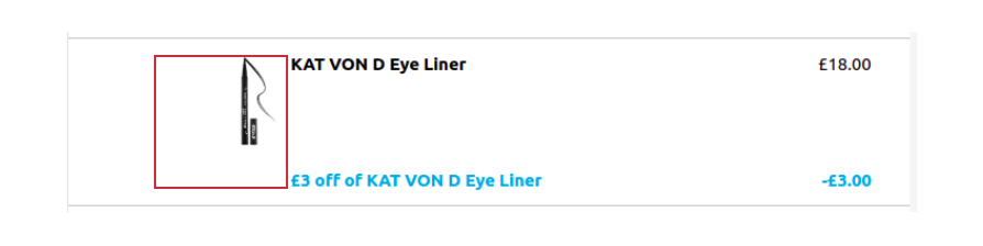
This will be the component to be used when you need to render an HTML <image> element in React Pos. See the product image below. This image is resolved from the request to the backend first and then that image is rendered.
<Image
    imageURL={"image://PRODUCT/1177567.jpg"}
    imageType="Image"
    maxHeight={120}
/>
-
imageURL - URL of the image. If the image is to be resolved from the backend then URL will have a format like in the above code snippet and you also have to provide the imageType as “image“
imageURL={"image://PRODUCT/1177567.jpg"}imageURL={"/images/enactor/header/transactions-ok.png"}(image URL can also be a relative path of the image inside the public folder in React Pos)
-
imageType - This will be passed as the resource type to the resource resolver.
imageType="Image"
-
maxHeight - This will be the maximum height that the image can take in pixels. This will be directly set as the maxHeight property in styles of the JSX
<img>element.
ResolvableMessage
This is the component that is used to translate a message using its messageId and arguments for the expression if it has any. See the following code sample. When it is rendered it will call the backend function that does the translation and gives a string output as shown below.
<ResolvableMessage
    messageBase="NextGen/PosMessages"
    messageId="RESULT_PAGE_COUNTER"
    expressionData={{ totalHitCount, totalRows, pageSize }}
/>
The actual message definition inside the PosMessages.xml file for the above component.
<core:message key="RESULT_PAGE_COUNTER">
    {totalHitCount} matches found{totalHitCount > totalRows ? concat(', capped to ', totalRows) : ''} - Page {convert:toInt(productPagedList.currentRowOffset / pageSize) + 1} of {ceil(totalRows / pageSize)}
</core:message>
Supported props
- messageBase - Message base URL where that has the messageId defined in.
- messageId - Message-ID of the message to be rendered.
- expressionData - Data arguments required to render the message. This is optional. Only required if the message is a templated message like the given example above.

FormattedAmount
This is the component that you should use when you need to show an amount formatted according to currency type. See the example below and refer to the following code snippet.
<FormattedAmount
    amount={<amount>}             // amount to be formamted Ex: 1500
    currencyId={<currency_id>}    // currency id Ex: GBP
/>
Supported props
- amount - Amount to be formatted.
- currencyId - Currency ID to be used when formatting the amount.
To format the amount (numeric value) according to the locale, You can just pass the amount prop only.

SaleShellContainer
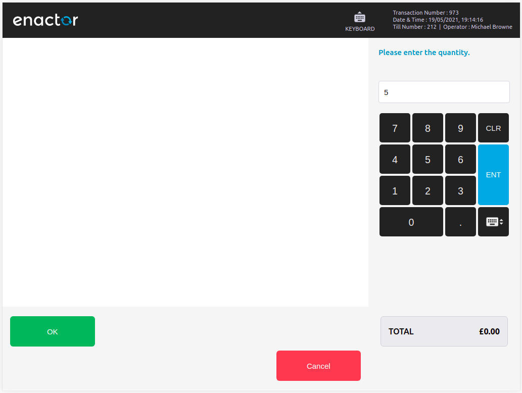
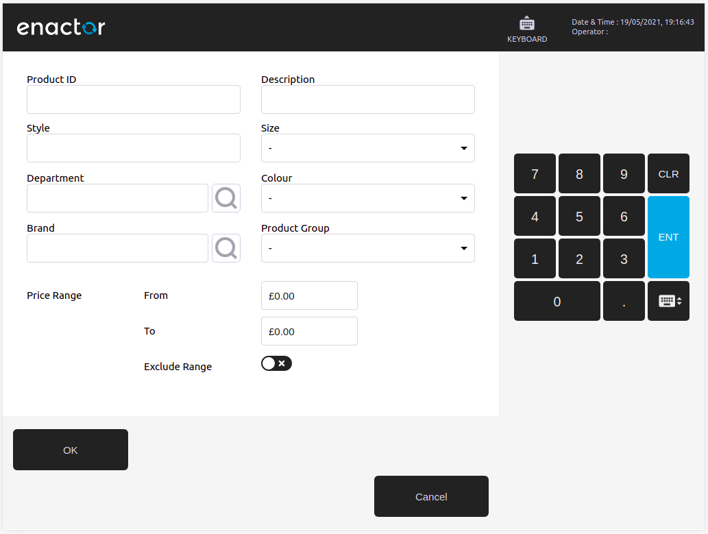
This is a component that represents a complete prompt of the React Pos. This component can be used to show a simple prompt state. A simple prompt state means that the basket area does not be used by the prompt. A simple prompt state is shown in the first example below, where user interaction is only with the prompt input. A nonsimple prompt is shown in the second example, where a few input components are visible in the basket area.
Following is the code snippet for the simple prompt.
<SaleShellContainer
    fallbackMenuButtons={defaultButtons}        // menu buttons defined for the prompt
    formatterConfig={[NUMBER_TYPE]}             // formatting config for number type prompt input
    messageBase="Pos/Product/ProductMessages"
    messageId={getMessageId()}                  // this function will resolve the message id
    onSubmit={handleValueSubmit}
    showMobileKeyPadOnMount={true}
/>
Supported props
-
fallbackMenuButtons - Menu buttons defined for the prompt. Following is the exact code that is given for the menu of that simple prompt. This will be explained under the Menu buttons section (TODO).
-
const defaultButtons = [{menuItemPosition: 1,className: "ftr-button ok",messageBase: "Pos/General/PosMessages",messageId: "BUTTON_OK",submitOnEnter: true,onClickHandler: () => onEvent(promptUrl, "OKPressed")},{menuItemPosition: 8,className: "ftr-button cancel",messageBase: "Pos/General/PosMessages",messageId: "BUTTON_CANCEL",onClickHandler: () => sendEvent("CancelPressed")}];
fallbackMenuButtons={defaultButtons}
-
-
messageBase - Message base of the prompt title.
-
messageId - Message-ID of the prompt title.
-
onSubmit - Callback function to be called when the user enters a text in prompt input and press the Enter button.
-
showMobileKeyPadOnMount - This boolean flag decides whether to show or hide the keypad in mobile resolution.
showMobileKeyPadOnMount={true}
MenuContainer
This is the component that renders the menus in a prompt. See the footer menu buttons shown earlier. If the data required to render a menu is available from the Redux Store means that that the menu is configured in Estate Manager then MenuContainer takes that data and renders the menu accordingly (For example Sale prompt). Not all the prompts have configured menu and therefore prompt need to define a default menu inside the prompt component. See the following example.
<MenuContainer
    fallbackMenuButtons={defaultButtonsSet}   // this is same as fallbackMenuButtons prop we discussed under SaleShellContainer
                                              // SaleShellContainer has a MenuContainer compoenent within it to recive the fallbackMenuButtons
/>
Supported props
-
fallbackMenuButtons - This is an array of JSON defining the structure of the menu. It is possible to define nested menus as well. Each menu item has to have the following structure.
-
{visibility: <visibiliy>, // visibility of the menu itemmenuItemPosition: <position>, // menu item position as depicted in the positions image earliermessageBase: <message_base>, // message base for the menu buttonmessageId: <message_id>, // message id for the menu buttonclassName: <class_name>, // CSS className for the menu buttononClickHandler: () => { ... }, // callback function to be called when user clicks on the button// If one of the following two properties are added (both of them cannot be in the same menu button)// to a menu button then onClickHandler will be reassined by the MenuContainer to handle menu traversal.subMenus: [{...}, {...}], // sub menus for this menu button (onClickHandler you provide will be ignored)backButton: true // indication for back button in nested menus (onClickHandler you provide will be ignored)}
-
Example menu having nested menus will like below
const fallbackMenuButtons = [
        {
            menuItemPosition: 1,
            messageBase: "Pos/General/PosMessages",
            messageId: "BUTTON_OK",
            className: "ftr-button ok",
            onClickHandler: () => onEvent(promptUrl, "OKPressed")
        },
        {
			menuItemPosition: 5,
			messageBase: "Pos/Tender/TenderMessages",
			messageId: "BUTTON_MORE",
			subMenus: [
				{
					menuItemPosition: 1,
					visibility: "#{!empty (showPostCodeSearch) && showPostCodeSearch}",
					messageBase: "Pos/Loyalty/LoyaltyMessages",
					messageId: "BUTTON_POST_CODE_SEARCH",
					onClickHandler: () => eventHandlers.sendEvent("PostCodeSearch")
				},
				{
					menuItemPosition: 8,
					visibility: "#{notEmpty(allowCancel) && allowCancel}",
					messageBase: "Pos/General/PosMessages",
					messageId: "BUTTON_BACK",
					className: "ftr-button",
					backButton: true
				}
			]
		}
    ]
Calendar
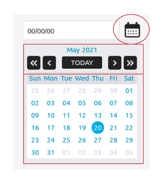
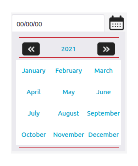
This is the component that you see when you need to pick a date as the input. When the user clicks on the calendar icon, circled in the date picker below, it will popup the date picker component. If the user then clicks on the “May 2021” label it will load the view to pick the month, shown in the second image. This component is used inside the ConnectedTextInput component to show when the data type is Date. See the following examples where you can enable this Calendar component.
import { DATE_TYPE, DD_MM_YY } from "@enactor/react-base-components";
...
...
<ConnectedTextInput
    formatterConfig={[DATE_TYPE, DD_MM_YY]}
    ...
    ...
/>
import { DATE_TYPE, DD_MM_YY } from "@enactor/react-base-components";
...
...
<SaleShellContainer
    formatterConfig={[DATE_TYPE, DD_MM_YY]}
   ...
   ...
/>
Sub Components
This date picker component has the following sub-components.
-
DatePickerHeader - Shown in the top rectangular area of the date picker below.
-
DatesGrid - Shown in the bottom rectangular area of the date picker below.
-
DatePicker - This is composed using DatePickerHeader and DatesGrid components.
-
MonthPickerHeader - Shown in the top rectangular area of the month picker below.
-
MonthsGrid - Shown in the bottom rectangular area of the month picker below.
-
MonthsPicker - This is composed using MonthPickerHeader and MonthsPicker components.
-
Calendar - This is composed using DatePicker and MonthsPicker components.
-
name - Name for the whole calendar component. This will be set as the
date-picker-nameattribute. -
value - Initial value of the selected date. This should be a Javascript Date object.
-
onChange - This is the callback function that gets called when a user clicks on one of the days. It calls the callback function with the selcted date string in the format of
dd/mm/yy. -
selectableRange - This is the date range that the user is allowed to select a date from. It should be in the following format.
{ start: <start_date>, end: <end_date> }- start and end dates should Javascript Date objects.
-
locale - Locale for the calendar component.
-
onClose - This is the callback gets called when the user clicks on a date.
-
You can override any of the above and customize them as per your need.
How to override an existing component
The component should have been exported using withCustomComponent (This is the wrapper component that supports the overriding capability) to override an existing component in the react pos component. See the following left side code snippet that exports the MonthsGrid component using “MonthsGrid“ as the component key. This key is the one that is used to map to a new component.
import React from "react";
import withCustomComponent from "../../../Enactor/withCustomComponent";

export const KEY = "MonthsGrid";

const MonthsGrid = ({ ... }) => {
    ...
    ...
    return (
        <>
           ...
           // existing logic to render dates
           ...
           ...
        </>
    );
};

export default withCustomComponent(MonthsGrid, KEY);
import React from "react";

const CustomisedMonthsGrid = ({ ... }) => {
    ...
    ...
    return (
        <>
           ...
           // logic to render dates in column wise
           ...
           ...
        </>
    );
};

export default CustomisedMonthsGrid;
Refer to the MonthsGrid under the Calendar section we discussed above. Let’s say if you wanted to show the dates of the grid in column vise manner (top to bottom instead of left to right). Then you should create a new component(Let’s name it as CustomisedMonthsGrid ) that receives the same props as MonthsGrid receives but does the rendering column vise as we said. It will look like a code snippet on the above right side. This new component should go under the /Template Customer - React Pos/src-js/packages/template-customer-react-pos/src/Components file path.
To override the MonthsGrid component with CustomisedMonthsGrid component you need to add an entry like below in the /Template Customer - React Pos/src-js/packages/template-customer-react-pos/src/Configuration/TemplatePosComponentsMap.js file. Refer to the following code snippet.
import CustomisedMonthsGrid from "../Components/CustomisedMonthsGrid";

const TemplatePosComponentsMap = {
    ...
    ...
    MonthsGrid: CustomisedMonthsGrid      // <overridden_component_key>: <overriding_component>
};

export default TemplatePosComponentsMap;
How to add a new prompt in customer's React Pos project
If you have added a new page definition(prompt) and it is used in an overridden application process or newly added application process as a prompt state then you need to create that prompt in the customers React Pos project as well. Consider the code snippet on the right side as the newly added prompt (Let’s name it as SelectDigitalCurrencyType).
This component should also go under the Components directory in /Template Customer - React Pos/src-js/packages/template-customer-react-pos/src/Components file path.
You need to add a route entry for this component in the routes file given in /Template Customer - React Pos/src-js/packages/template-customer-react-pos/src/Configuration/TemplateRoutes.js as given in the below code snippet.
import { EnactorRoutes } from "@enactor/react-pos";
import SelectDigitalCurrencyType from "../Components/SelectDigitalCurrencyType";
const TemplateRoutes = {
   ...
   ...
    <route_name>: {                           // unique name for the route
      processId: <process_id>                 // process id of the application process
      promptUrl: <prompt_url>,                // prompt URL of the prompt state
      component: SelectDigitalCurrencyType,   // mapping for the component
    }
};

export default Object.assign({}, EnactorRoutes, TemplateRoutes);
You should be careful when placing the processId in the route.
If there is only one prompt for the promptUrl then you should not declare the processId property and route_name can be as same as the promptUrl.
There can be prompts that have the same prompt URL but different content will be rendered depending on the process it is used. In that case, you need to add the processId as well. And the route_name can be made unique by giving a name in the form of "<process_id>_<prompt_url>".
import React from "react";

import { ... } from "@enactor/react-base-components";
import { ... } from "@enactor/react-pos";
import { ... } from "@enactor/react-javascript-bridge";
import { ... } from "@enactor/redux-javascript-bridge";

const SelectDigitalCurrencyType = (props) => {
    ...
    ...

    return (
       <>
        ...
        ...
       </>
    );
};

export default SelectDigitalCurrencyType;
Useful notes when implementing data capturing screens
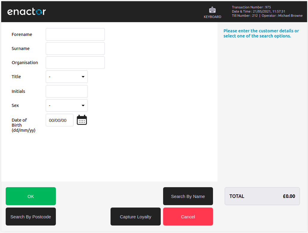
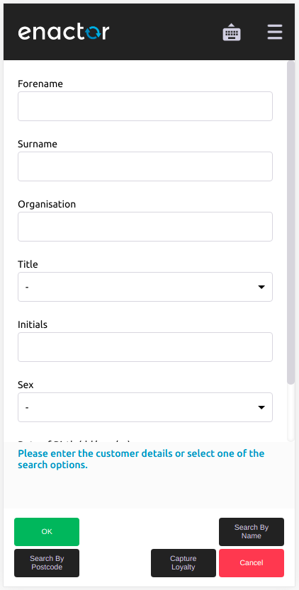
As you have already seen in the Inputs section we can use these elements to compose a form. There are already defined wrapper components with styles added to them. The first example below also shows the label along with an input. If pos runs in a mobile resolution then the label is shown on top of the input, as seen in the second example. The following code refers to that form.
import { CaptureForm, CaptureDataRow } from "@enactor/react-base-components";
...
<CaptureForm>
    <div className="form-row margin-0">
        <CaptureDataRow
            className="form-row half"
            label={
                <ResolvableMessage
                    messageBase={<message_base>}
                    messageId={<message_id>}
                />
            }
        >
            <ConnectedTextInput
                name={"forename"}
                ...
                ...
            />
        </CaptureDataRow>
    </div>
    ...
    ...
    ...
</CaptureForm>
Following are the main elements you will be using.
-
CaptureForm - Container for all the inputs in the form. Internally It uses
HTML <form>element and some generic styles. This component only accepts children as the prop which will be all the content that you wrap with CaptureForm. -
CaptureDataRow - This is the wrapper for labels and the input component for a data capturing row. As given in the above code snippet you should wrap your input component and set some props like below.
- label - This is the label of the input component.
- required - Flag to indicate that the input is required or not. The default value is set to false. If you set this to true it will show a red asterisk (*) after the label.
- className - Any additional styles you need to set for the data row should be set as a new CSS class.
- labelColumnSize - This is set as an argument for the className set for the label element (
className={`form-col-${labelColumnSize}`}). This will decide the width of the label. - inputColumnSize - This is set as an argument for the className set for the input element (
className={`form-col-${inputColumnSize}`}). This will decide the width of the input.
There are predefined CSS classes like below. It will set the percentage widths will be set as given below.
form-col-12- 100%form-col-6- 50%form-col-4- 33.33%form-col-3- 25%form-col-2- 16.66%form-col-8- 66.66%form-col-10- 83.33%
All of these classes will set the width to 100% when in mobile resolution, as in the mobile example below.
If you want to show a more compact view of the form then use margin-0 class. Data capture rows will be placed close to each other.