Create a React Prompt with Selection
This will guide you through overriding an existing prompt URL by creating a custom React component where the user selects from a set of options in the Customer Extension React Pos project.
Overview
In this exercise, we will override the existing Pos/Reason/SelectReason prompt URL by creating a custom React component in the extension project. The existing process Pos/Reason/SelectReasonCode already contains a SelectReasonCode prompt state that we will target. By registering a React component against the same prompt URL, our custom implementation will take precedence over the default one.
Finding the Process and Prompt State
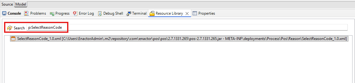
First, let's locate the process we are going to work with using the Resource Library.
-
Open the Resource Library view in Eclipse.
-
Search for p:SelectReasonCode to find the SelectReasonCode process.
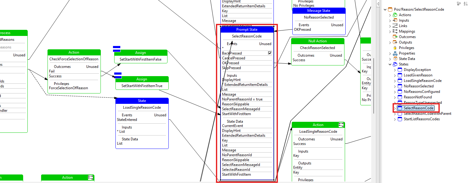
- Open the SelectReasonCode process. You can see the process flow and identify the SelectReasonCode prompt state which is the prompt we will be implementing.
Creating the React Component
- Right-click on the SelectReasonCode prompt state in the process editor and navigate to Enactor -> Create React Component.
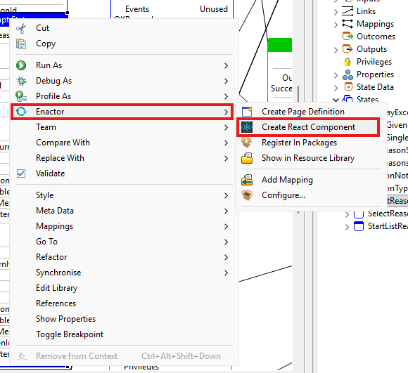
This will open the React Component Wizard. Fill in the fields as follows:
- React Component Directory: Select the components directory of your extension project (e.g.
/TrainingPOSExtension/src-js/packages/trainingposextension/src/components). - React Component File Path: This will be auto-populated as
SelectReasonCode/SelectReason. - Register in Routes: Ensure this is checked.
- Routes File Name: Select the routes file of your extension project (e.g.
/TrainingPOSExtension/src-js/packages/trainingposextension/src/routes/routes.jsx). - React Component Name:
SelectReasonCode - Prompt URL:
Pos/Reason/SelectReason
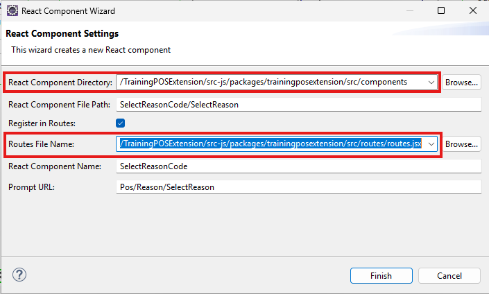
Click Finish.
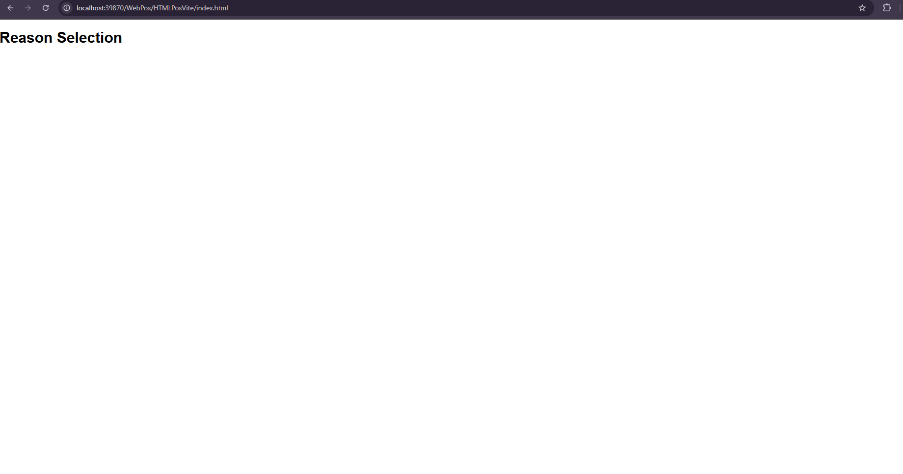
- Now delete the entire content of the generated index.js file and replace it with the following simple React component:
import React from "react";

const SelectReasonCode = () => {
  return <h1>Reason Selection</h1>;
};

export default SelectReasonCode;
-
This is a React functional component which returns some text.
-
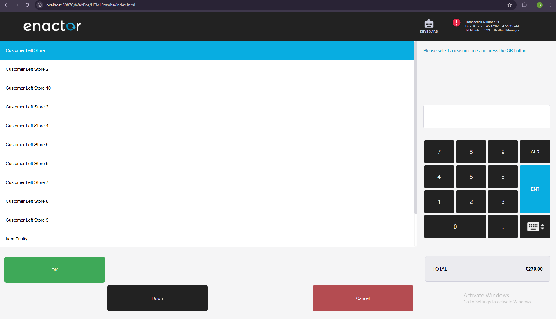
Now sign in and add the item
0WXIVEXinto the basket.Then navigate to Voids → Transaction Void and it will show the the below prompt.
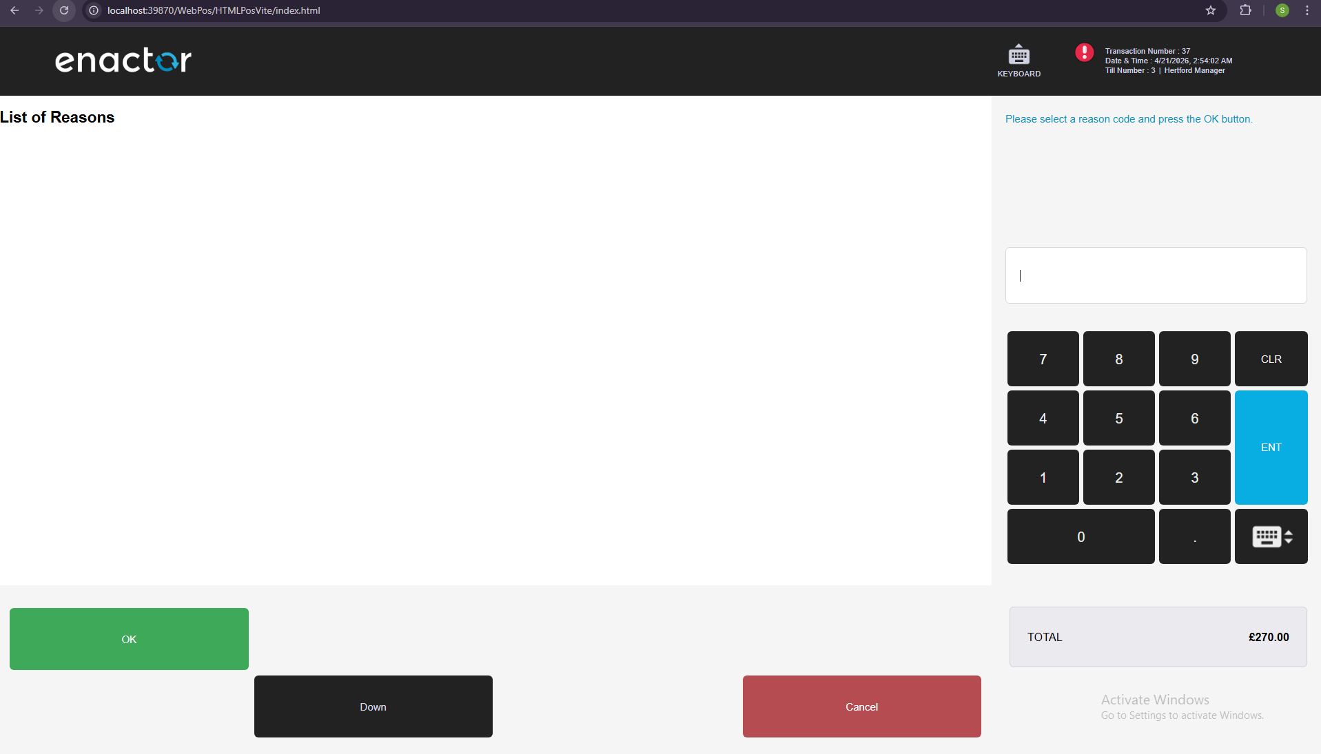
Creating a Selectable prompt
-
There is a predefined class called Selectable which has most of the functionality needed for a selection prompt.
-
We will also use predefined footer buttons component called SelectableFooter. Which has Up/Down and OK/Cancel buttons.
-
Replace the index.js with the following code as a starting point.
import React from "react";
import { connect } from "react-redux";
import {
  BodyKeypad,
  defaultMapDispatchToProps,
  defaultMapStateToProps,
  Header,
  Selectable,
  PromptDataUtils
} from "@enactor/react-base-components";
import { SelectableFooter } from "@enactor/react-pos";

const MESSAGE_BASE = "Pos/Reason/ReasonMessages";

class SelectReasonCode extends Selectable {
	constructor(props) {
		super(props);
		this.getList = this.getList.bind(this);
	}
	render() {
    const { props, incrementSelectedIndex, decrementSelectedIndex } = this;

    const { eventHandlers, promptInstanceId, promptData } = props;

	  const { selectReasonMessageId } = promptData;

    return (
      <React.Fragment>
        <Header
          eventHandlers={eventHandlers}
          promptInstanceId={promptInstanceId}
          disableBagButton={true}
        />
        <div className="body-area">
          <div className="body-main">
            <div className="body-left">
              <div className="selection-wrap">
                <div className="selection-box">
                    <h2>List of Reasons</h2>
                </div>
              </div>
            </div>
            <BodyKeypad
              promptInstanceId={promptInstanceId}
              eventHandlers={eventHandlers}
              messageId={selectReasonMessageId}
              messageBase={MESSAGE_BASE}
            />
          </div>
          <SelectableFooter
            incrementSelectedIndex={incrementSelectedIndex}
            decrementSelectedIndex={decrementSelectedIndex}
            listBounds={{
              maxIndex: this.state.maxIndex,
              minIndex: this.state.minIndex,
            }}
            selectedIndex={this.state.selectedIndex}
            promptInstanceId={promptInstanceId}
            eventHandlers={eventHandlers}
          />
        </div>
      </React.Fragment>
    );
  }
}

export default connect(
  defaultMapStateToProps,
  defaultMapDispatchToProps
)(SelectReasonCode);
-
Header component is to show the basket header.
-
BodyKeypad is the component to show the RHS section. We have provided the messageBase and the messageId to generate the prompt message. Here the
messageIdis taken from promptData.selectReasonMessageId because the message varies depending on the scenario that triggered this prompt.
-
SelectableFooter has been given following props which are already available from Selectable class.
-
incrementSelectedIndex - to increment the selected index when clicking Down button
-
decrementSelectedIndex - to decrement the selected index when clicking Up button
-
listBounds , selectedIndex- to show/hide Up/Down buttons according to the number of items available to select.
-
If you click on Up/Down buttons they will still work even though the items are not visible.
-
Selectable component does few things initially.
-
It gets the list from prompt data and initialize the maxIndex and minIndex.
-
Sets the initial selectedIndex.
-
-
If your list has read only items also (means some of the list items are not selectable) then you need to override the getList function.
- Create another file called ReasonCode.js and following snippet as its content.
import React, { useRef } from "react";
import { resolveClassName } from "@enactor/react-base-components";

const ReasonCode = ({
  reasonCode,
  isSelected,
  handleSelectedChanged,
  reasonCodeIndex,
}) => {
  const {
    data: { description },
  } = reasonCode;

  return (
    <div
      className={resolveClassName("selection-row", { selected: isSelected })}
      onClick={() => handleSelectedChanged(reasonCodeIndex)}
    >
      {description}
    </div>
  );
};

export default ReasonCode;
-
This is to represent an item of the selectable items list.
-
The isSelected is a boolean value, we can attach a class depending on that to make the currently selected item highlighted.
className={resolveClassName("selection-row", { selected: isSelected })}
-
This line of code appends "selected" css class name to its class name ("selection-row") if selected is true.
-
Similar to selection using Up/Down buttons, it should be possible to select an item by clicking on an item. Following click handler is defined for that purpose. Will see what is the actual click handler later.
onClick={() => handleSelectedChanged(reasonCodeIndex)}
- Visible text of a selectable item is taken from the description property as below.
const {
  data: { description },
} = reasonCode;
- Next, create another file called ListReasonCodes.js and following snippet as its content.
import React from "react";
import ReasonCode from "./ReasonCode";

const ListReasonCodes = ({
  selectedIndex,
  handleSelectedChanged,
  reasonCodes = [],
}) => {
  if (reasonCodes.length === 0) {
    return null;
  }

  const reasonCodeItems = reasonCodes.map(
    (reasonCode, reasonCodeIndex) => {
      return (
        <ReasonCode
          reasonCode={reasonCode}
          isSelected={reasonCodeIndex === selectedIndex}
          handleSelectedChanged={handleSelectedChanged}
          reasonCodeIndex={reasonCodeIndex}
          key={reasonCodeIndex}
        />
      );
    }
  );

  return <React.Fragment>{reasonCodeItems}</React.Fragment>;
};

export default ListReasonCodes;
-
This component is to iterate over the list items and provide the required props to the ReasonCode components.
-
Now it should be possible to think how the ReasonCode got its props.
-
isSelected prop is calculated using selectedIndex (which is a prop for this component) as below.
isSelected={reasonCodeIndex === selectedIndex}
-
Let's go back to index.js file.
-
import ListReasonCodes.
import ListReasonCodes from "./ListReasonCodes";
- Replace
<h2>List of Reasons</h2>with the following code snippet.
<ListReasonCodes
  reasonCodes={this.getList()}
  selectedIndex={this.state.selectedIndex}
  handleSelectedChanged={this.handleSelectedChanged}
/>
-
All the three props made available from Selectable.
-
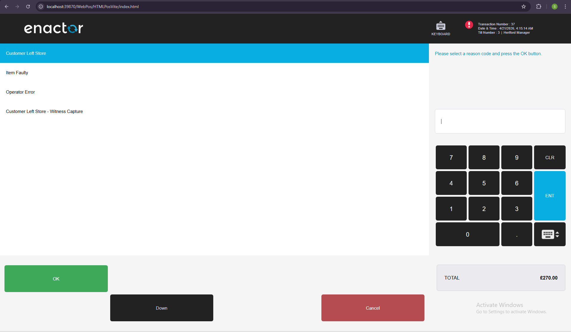
Now check the UI for this prompt. Now it should display the list of items.
-
When you click on an item it will be selected (background color will be changed to Blue).
Sending and processing the event
- Again in the index.js, define handleSubmit function inside SelectReasonCode.
  handleSubmit = () => {
    const {
      eventHandlers: { sendEvent },
    } = this.props;
    sendEvent("OKPressed", { selectedItemIndex: this.state.selectedIndex });
  };
- Add this function as the submitHandler prop for the BodyKeypad. This will send the selected index data when the Enter button is clicked in the keypad.
<BodyKeypad
    ...
    ...
    ...
    submitHandler={this.handleSubmit}
/>
- To send the data when the OK button is pressed, add data prop with selectedIndex information.
<SelectableFooter
    ...
    ...
    ...
    data={{ selectedItemIndex: this.state.selectedIndex }}
/>
Add auto-scrolling for the selection prompt
-
To make automatically scroll the item towards middle of the prompt is handle using a custom hook called useListItemScroll. To add that UI functionality update the code as follows.
-
In ReasonCode.js, add following imports.
import ..., { useRef } from "react";
import {
    ...
    useListItemScroll
} from "@enactor/react-base-components";
- Update the ReasonCode function like below.
const ReasonCode = ({
    ...
    ...
    gridBodyContainer
}) => {
    const rowRef = useRef();
    useListItemScroll(isSelected, gridBodyContainer, rowRef);

    ...
    ...

    return (
        <div
            ...
            ...
            ref={rowRef}
        >
            {description}
        </div>
    );
};
- In ListReasonCodes.js file, pass the gridBodyContainer prop to ReasonCode.
const ListReasonCodes = ({
    ...
    ...
    gridBodyContainer
}) => {

    if (reasonCodes.length === 0) {
        return null;
    }

    const reasonCodeItems = reasonCodes.map((reasonCode, reasonCodeIndex) => {
        return (
            <ReasonCode
                ...
                ...
                gridBodyContainer={gridBodyContainer}
            />
        );
    });

    return <React.Fragment>{reasonCodeItems}</React.Fragment>;
};
- In render method of SelectReasonCode in index.js file, create a React ref and add that ref to the wrapper div of <ListReasonCodes/>.
const gridBodyRef = React.createRef();
- Pass the gridBodyContainer prop as gridBodyRef created to ListReasonCodes.
<div className="selection-box" ref={gridBodyRef}>
    <ListReasonCodes
        ...
        ...
        gridBodyContainer={gridBodyRef}
    />
</div>
- Configure as many reason codes until a scroll bar appears and check how the auto scrolling works when a user clicks on a list item.