Creating a selection prompt
This will explain how to implement a React page for a Page Definition in the Customer Extension React Pos project.
This will guide you to implement a React prompt for a given Page Definition prompt where a user does a selection from a set of options.
Prerequisites
The mobile pos terminal needs to have a test ICC reader configured.
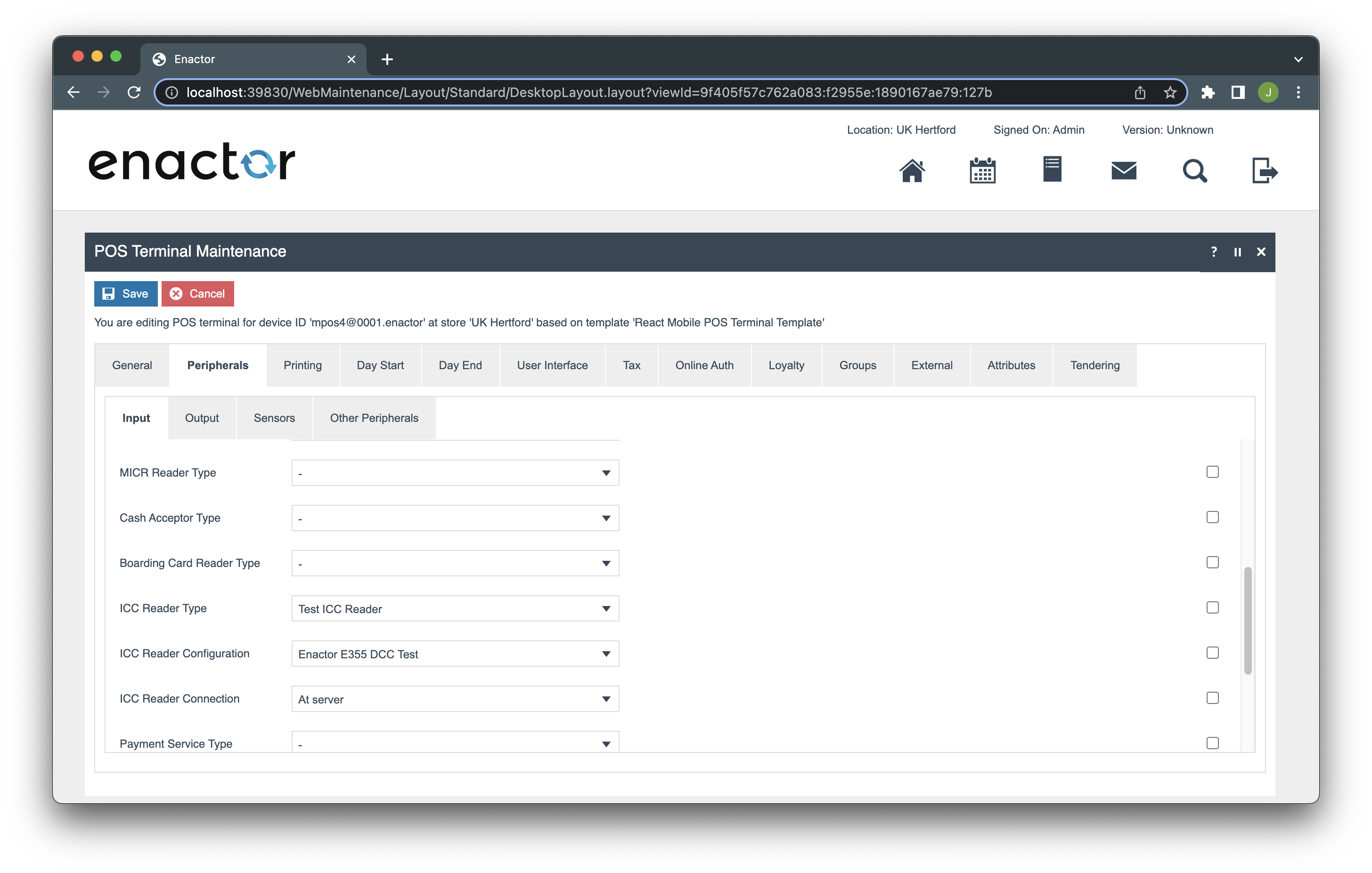
Go to Web Maintenance → POS Terminal Maintenance → search for the device id (e.g mpos4@0001.enactor) → Edit
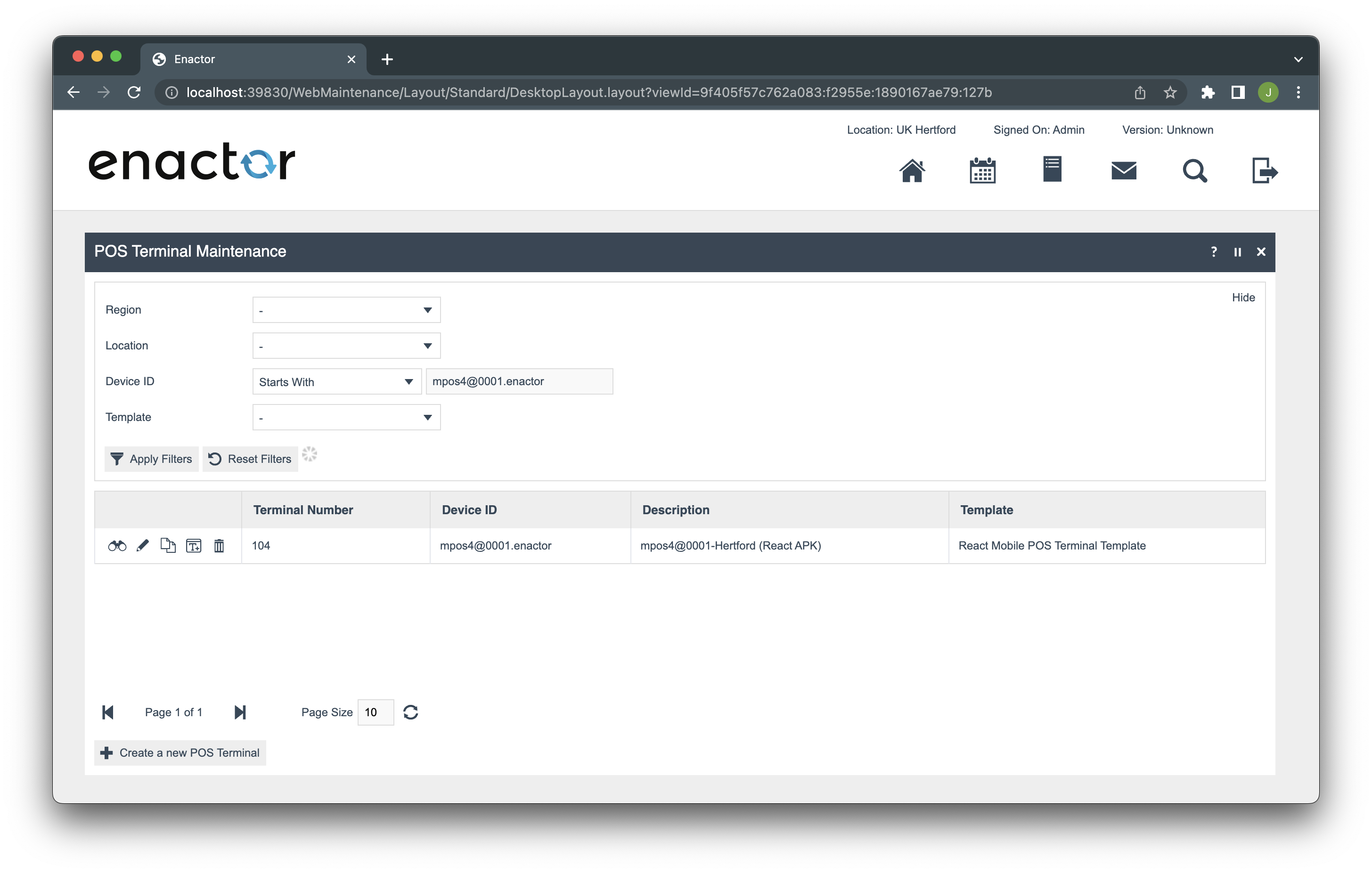
Go to Peripherals → Input
-
Set ICC Reader Type to “Test ICC Reader”
-
Set ICC Reader Configuration to “Enactor E355 DCCTest”
- Set ICC Reader Connection to “At Server”
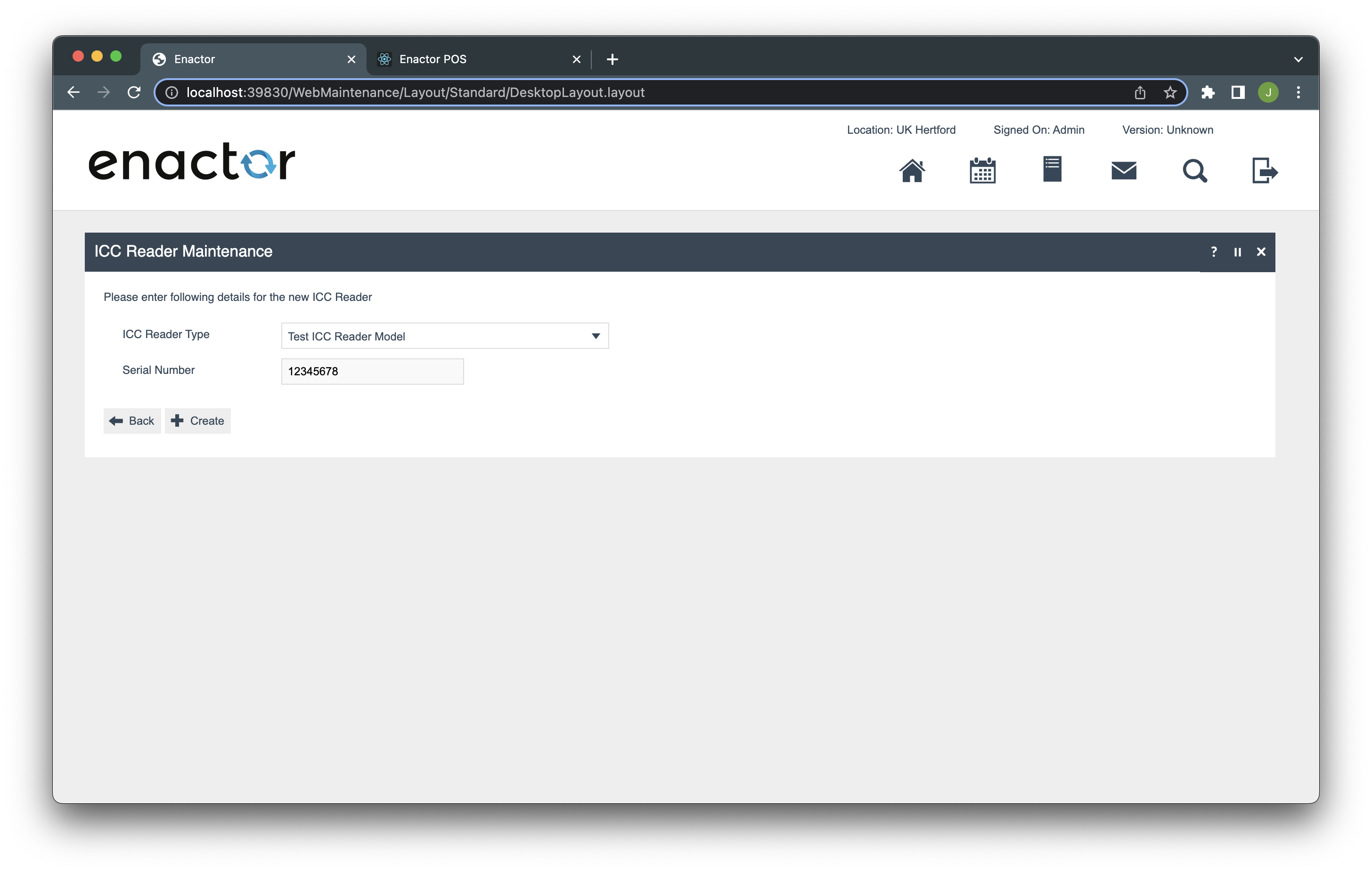
Go to ICC Reader Maintenance → Create a new ICC Reader
-
Select the Test ICC Reader Model and enter the serial number 12345678
-
Set the location to UK Hertford
-
Save
Restart the PDP Server
Preparation
You need to have an unimplemented prompt for this task. Here we will provide a process and a prompt for that. We will override an existing process (CardPayment/DoICCApplicationSelection) to start work on.
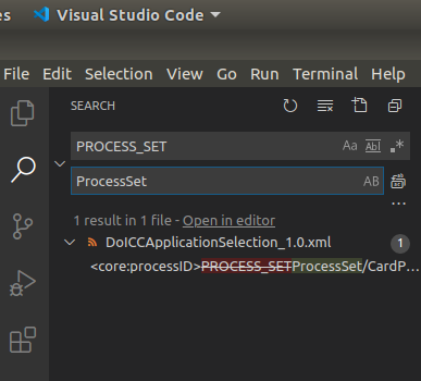
Download Preparation.zip and unzip.
Open the Preparation folder in vscode and replace the PROCESS_SET texts in with the actual ProcessSet in DoICCApplicationSelection_1.0.xml file.
-
Go to eclipse workspace.
-
Open the Template Customer - POS project if haven’t open it yet.
-
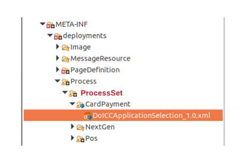
In project explorer, Navigate to
/Template Customer - POS/src/META-INF/deployments/Process/[ProcessSet]/CardPayment -
Copy and paste DoICCApplicationSelection_1.0.xml to this location.
You may need to create folders in the path if they are not there already.
-
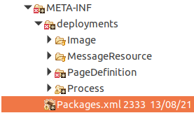
Open the Packages.xml file in Template Customer - POS project.
-
Register the newly added process by adding following under
core:packagein this file.
<core:packageProcess>
    <core:processId>PROCESS_SET/CardPayment/DoICCApplicationSelection</core:processId>
    <core:name>Do ICC Application Selection</core:name>
    <core:version>1.0</core:version>
</core:packageProcess>
-
Replace PROCESS_SET with your ProcessSet.
-
Maven update the Template Customer - POS in offline mode.
-
Restart your PDP Server.
-
Go to the web pos in http://localhost:3000 and clear cookies and refresh the page.
-
[Submit] the config page and go to Sign On page.
-
Enter Pos User credentials and press Enter.
-
Add an item to the basket.
-
Press Total → Select Card Tender → Press OK.
-
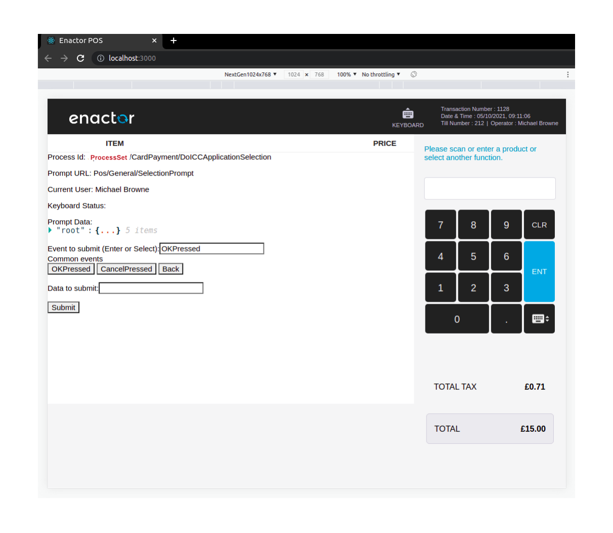
In Test ICCReader application select in Insert card Options menu select Request App Selection.
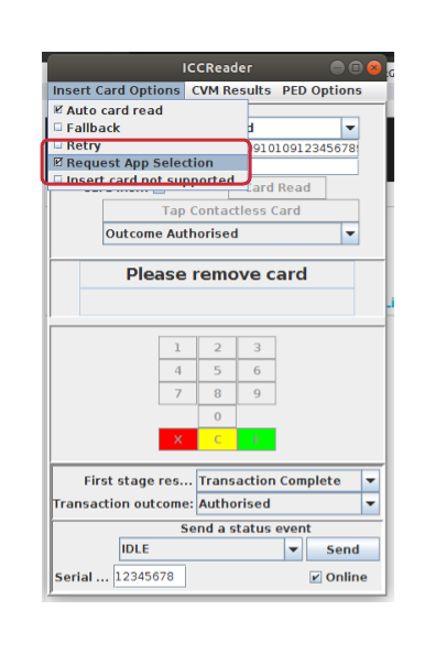
- Then click on Card Inserted tickbox, you will be redirected to the unimplemented screen.
Adding an empty page and a route
In the Template Customer - React Pos project that you have already opened in the vscode editor,
-
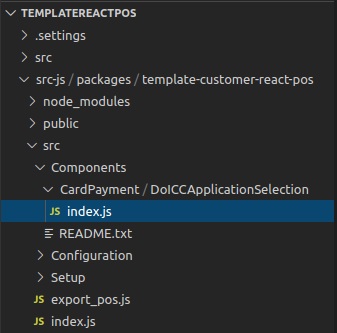
Navigate to /src-js/packages/template-customer-react-pos/src/Components folder.
-
Create a new folder called CardPayment inside that folder.
-
Inside CardPayment folder, create a new folder called DoICCApplicationSelection.
-
Create a new file called index.js in DoICCApplicationSelection folder.
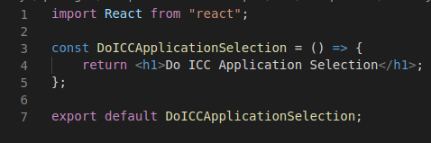
- Add the following as the content in the index.js file and Save it.
import React from "react";
const DoICCApplicationSelection = () => {
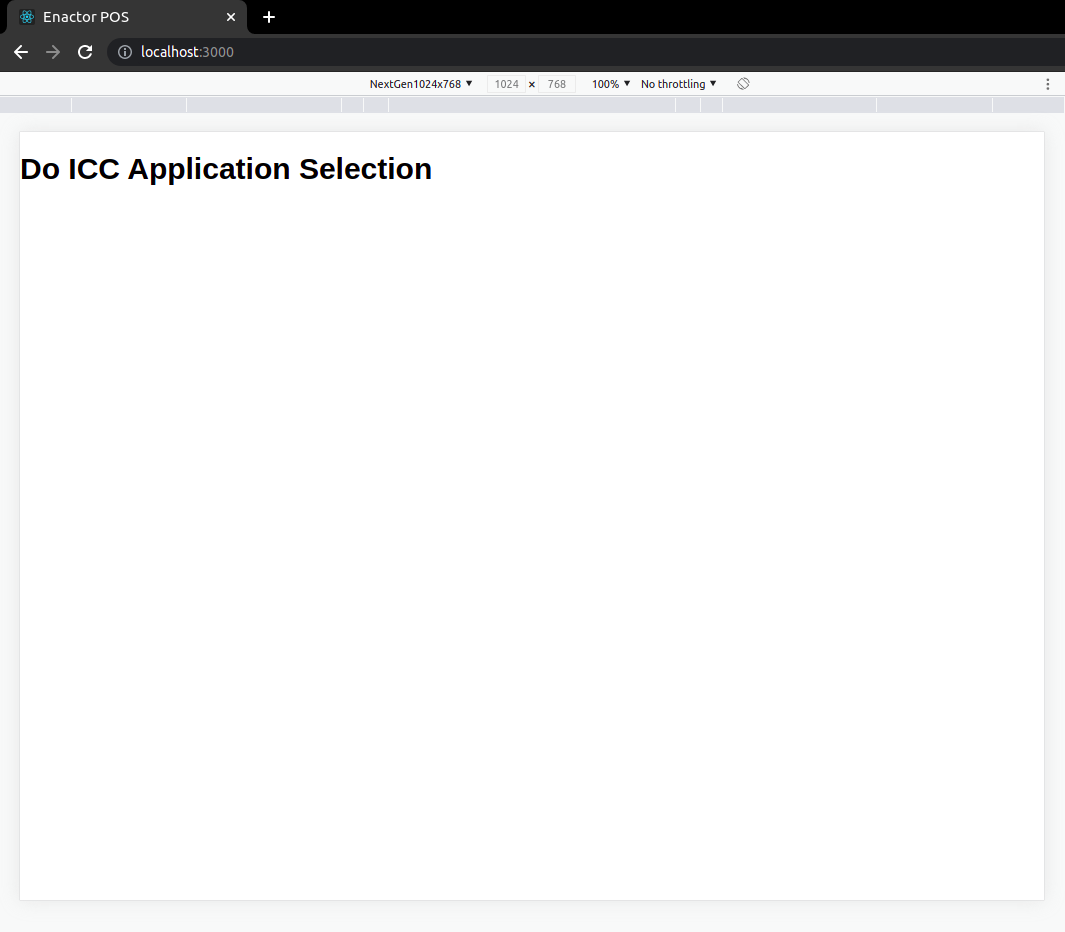
return <h1>Do ICC Application Selection</h1>;
};
export default DoICCApplicationSelection;
Next, we need to add a route for this prompt
-
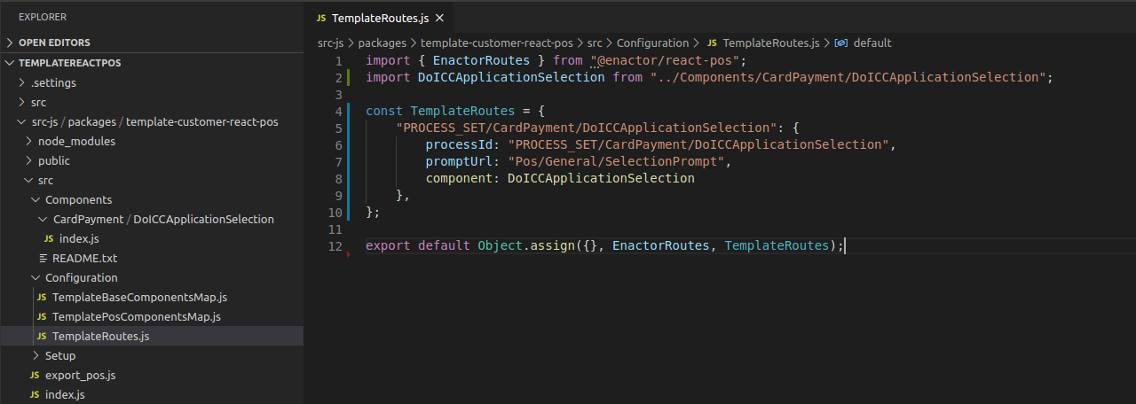
Navigate to /src-js/packages/template-customer-react-pos/src/Configuration folder.
-
In TemplateRoutes.js file, add a route for the new component we created in index.js file as shown.
-
Make sure to replace PROCESS_SET with your ProcessSet.
import DoICCApplicationSelection from "../Components/CardPayment/DoICCApplicationSelection";
"PROCESS_SET/CardPayment/DoICCApplicationSelection": {
    processId: "PROCESS_SET/CardPayment/DoICCApplicationSelection",
    promptUrl: "Pos/General/SelectionPrompt",
    component: DoICCApplicationSelection
}
- Save the file.
- Now check the web pos running in your browser. It should show the “Do ICC Application Selection“.
If a white screen / a loading icon is shown, remove the browser cookies and refresh the page. And then navigate to ICC Application Selection prompt.
Creating a Selectable prompt
-
There is a predefined class called Selectable which has most of the functionality needed for a selection prompt.
-
We will also use predefined footer buttons component called SelectableFooter. Which has Up/Down and OK/Cancel buttons.
-
Replace the index.js with the following code as a starting point.
import React from "react";
import { connect } from "react-redux";
import {
BodyKeypad,
defaultMapDispatchToProps,
defaultMapStateToProps,
Header,
Selectable,
} from "@enactor/react-base-components";
import { SelectableFooter } from "@enactor/react-pos";
const MESSAGE_BASE = "Pos/Tender/TenderMessages";
const MESSAGE_ID = "GET_APPLICATION_TITLE";
class DoICCApplicationSelection extends Selectable {
render() {
const { props, incrementSelectedIndex, decrementSelectedIndex } = this;
const { eventHandlers, promptInstanceId } = props;
return (
<React.Fragment>
<Header
eventHandlers={eventHandlers}
promptInstanceId={promptInstanceId}
disableBagButton={true}
/>
<div className="body-area">
<div className="body-main">
<div className="body-left">
<div className="selection-wrap">
<div className="selection-box">
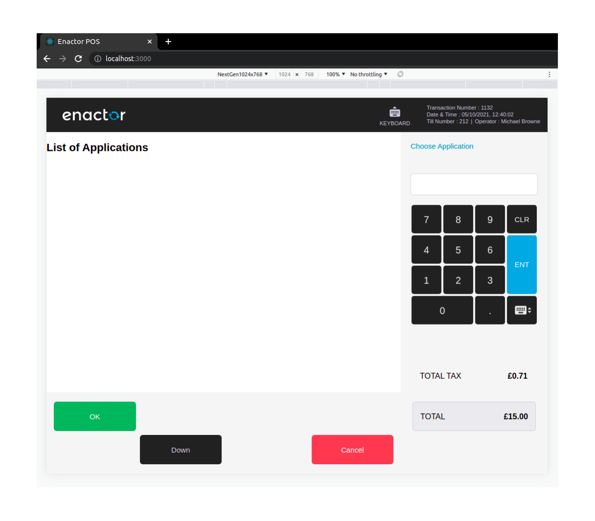
<h2>List of Applications</h2>
</div>
</div>
</div>
<BodyKeypad
promptInstanceId={promptInstanceId}
eventHandlers={eventHandlers}
messageId={MESSAGE_ID}
messageBase={MESSAGE_BASE}
/>
</div>
<SelectableFooter
incrementSelectedIndex={incrementSelectedIndex}
decrementSelectedIndex={decrementSelectedIndex}
listBounds={{
maxIndex: this.state.maxIndex,
minIndex: this.state.minIndex,
}}
selectedIndex={this.state.selectedIndex}
promptInstanceId={promptInstanceId}
eventHandlers={eventHandlers}
/>
</div>
</React.Fragment>
);
}
}
export default connect(
defaultMapStateToProps,
defaultMapDispatchToProps
)(DoICCApplicationSelection);
-
Header component is to show the basket header.
-
BodyKeypad is the component to show the RHS section. We have provided the messageBase and the messageId to generate the prompt message.
-
SelectableFooter has been given following props which are already available from Selectable class.
-
incrementSelectedIndex - to increment the selected index when clicking Down button
-
decrementSelectedIndex - to decrement the selected index when clicking Up button
-
listBounds , selectedIndex- to show/hide Up/Down buttons according to the number of items available to select.
-
If you click on Up/Down buttons they will still work even though the items are not visible.
-
Selectable component does few things initially.
-
It gets the list from prompt data and initialize the maxIndex and minIndex.
-
Sets the initial selectedIndex.
-
-
If your list has read only items also (means some of the list items are not selectable) then you need to override the getList function.
- Create another file called ICCApplication.js and following snippet as its content.
import React, { useRef } from "react";
import { resolveClassName } from "@enactor/react-base-components";

const ICCApplication = ({
  iCCApplication,
  isSelected,
  handleSelectedChanged,
  iCCApplicationIndex,
}) => {
  const {
    data: { description },
  } = iCCApplication;

  return (
    <div
      className={resolveClassName("selection-row", { selected: isSelected })}
      onClick={() => handleSelectedChanged(iCCApplicationIndex)}
    >
      {description}
    </div>
  );
};

export default ICCApplication;
-
This is to represent an item of the selectable items list.
-
The isSelected is a boolean value, we can attach a class depending on that to make the currently selected item highlighted.
className={resolveClassName("selection-row", { selected: isSelected })}
-
This line of code appends "selected" css class name to its class name (“selection-row“) if selected is true.
-
Similar to selection using Up/Down buttons, it should be possible to select an item by clicking on an item. Following click handler is defined for that purpose. Will see what is the actual click handler later.
onClick={() => handleSelectedChanged(iCCApplicationIndex)}
- Visible text of a selectable item is taken from the description property as below.
const {
  data: { description },
} = iCCApplication;
- Next, create another file called ListICCApplications.js and following snippet as its content.
import React from "react";
import ICCApplication from "./ICCApplication";

const ListICCApplications = ({
  selectedIndex,
  handleSelectedChanged,
  iCCApplications = [],
}) => {
  if (iCCApplications.length === 0) {
    return null;
  }

  const iCCApplicationItems = iCCApplications.map(
    (iCCApplication, iCCApplicationIndex) => {
      return (
        <ICCApplication
          iCCApplication={iCCApplication}
          isSelected={iCCApplicationIndex === selectedIndex}
          handleSelectedChanged={handleSelectedChanged}
          iCCApplicationIndex={iCCApplicationIndex}
          key={iCCApplicationIndex}
        />
      );
    }
  );

  return <React.Fragment>{iCCApplicationItems}</React.Fragment>;
};

export default ListICCApplications;
-
This component is to iterate over the list items and provide the required props to the ICCApplication components.
-
Now it should be possible to think how the ICCApplication got its props.
-
isSelected prop is calculated using selectedIndex (which is a prop for this component) as below.
isSelected={iCCApplicationIndex === selectedIndex}
-
Let’s go back to index.js file.
-
import ListICCApplications.
import ListICCApplications from "./ListICCApplications";
- Replace
<h2>List of Applications</h2>the with following code snippet.
<ListICCApplications
  iCCApplications={this.getList()}
  selectedIndex={this.state.selectedIndex}
  handleSelectedChanged={this.handleSelectedChanged}
/>
-
All the three props made available from Selectable.
-
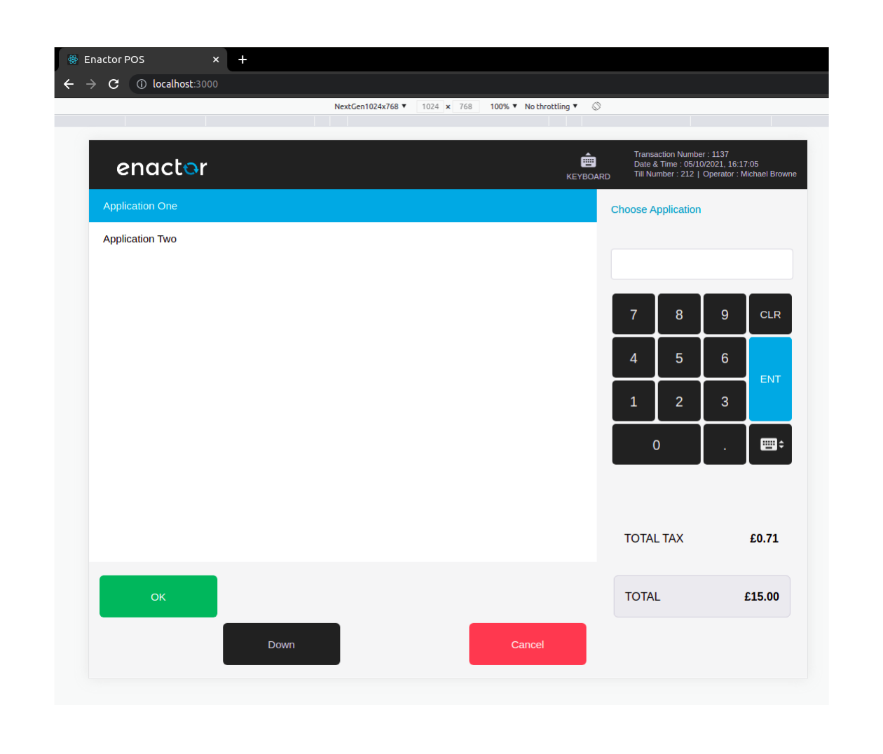
Now check the UI for this prompt. Now it should display the list of items.
-
When you click on an item it will be selected (background color will be changed to Blue).
Sending and processing the event
- Again in the index.js, define handleSubmit function inside DoICCApplicationSelection.
handleSubmit = () => {
  const {
    eventHandlers: { sendEvent },
  } = this.props;
  sendEvent("OKPressed", { selectedItemIndex: this.state.selectedIndex });
};
- Add this function as the submitHandler prop for the BodyKeypad. This will send the selected indes data when the Enter button is clicked in the keypad.
<BodyKeypad
    ...
    ...
    ...
    submitHandler={this.handleSubmit}
/>
- To send the data when the OK button is pressed, add data prop with selectedIndex information.
<SelectableFooter
    ...
    ...
    ...
    data={{ selectedItemIndex: this.state.selectedIndex }}
/>
- If you process debug and check when the OK button is pressed still the key is not set in the prompt state. key is the selected list item's key.
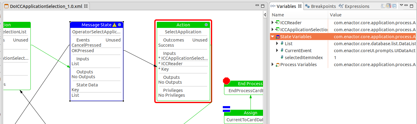
-
We need to process the event when it is received to the prompt state. We need to register a viewPrompt for this prompt.
-
We have a predefined Data Processor called SelectedItemDataProcessor.java. Which exaclty does what we need here. This processor takes the selectedIndex we send with event and get the item from List using the index and then access its key and set it to the prompt state.
More information on Data Processors can be found in Using Data Processors
-
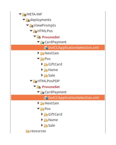
Navigate to Template Customer - React Pos project. Add DoICCApplicationSelection.xml given to the following two locations.
-
/META-INF/deployments/ViewPrompts/HTMLPos/ProcessSet/CardPayment
-
/META-INF/deployments/ViewPrompts/HTMLPosPDP/ProcessSet/CardPayment
-
<?xml version="1.0" encoding="UTF-8" standalone="yes"?>
<core:viewPrompts xmlns:core="http://www.enactor.com/core" xmlns:retail="http://www.enactor.com/retail" xmlns:sref="http://docs.oasis-open.org/wsbpel/2.0/serviceref" xmlns:tools="http://www.enactor.com/tools" xmlns:xsi="http://www.w3.org/2001/XMLSchema-instance">
    <core:viewId>VIEW_TYPE</core:viewId>
    <core:processId>PROCESS_SET/CardPayment/DoICCApplicationSelection</core:processId>

    <core:jsonPromptMapping>
        <core:url>Pos/General/SelectionPrompt</core:url>
        <core:contentUrl>${ReactPos.contentUrl}</core:contentUrl>
        <core:pageDefinitionUrl>HTMLPos/FullScreenBrowser</core:pageDefinitionUrl>
        <core:isContentUrlExternal>false</core:isContentUrlExternal>
        <core:processors>
            <core:processor name="retail:selectedItemDataProcessor"/>
        </core:processors>
    </core:jsonPromptMapping>
</core:viewPrompts>
-
Make sure to PROCESS_SET with your ProcessSet.
-
VIEW_TYPE shoud also be replaced with following in two files respectively.
-
HTMLPos
-
HTMLPosPDP
-
-
Refresh the Template Customer - React Pos project and maven update the Template Customer - Thin Server in offline mode.
-
Restart the PDP Server and navigate to the ICC App Selection prompt as we did before.
-
If you debug again, now it has set the key in prompt state.
Add auto-scrolling for the selection prompt
-
To make automatically scroll the item towards middle of the prompt is handle using a custom hook called useListItemScroll. To add that UI functionality update the code as follows.
-
In ICCApplication.js, add following imports.
import ..., { useRef } from "react";
import {
    ...
    useListItemScroll
} from "@enactor/react-base-components";
- Update the ICCApplication function like below.
const ICCApplication = ({
    ...
    ...
    gridBodyContainer
}) => {
    const rowRef = useRef();
    useListItemScroll(isSelected, gridBodyContainer, rowRef);

    ...
    ...

    return (
        <div
            ...
            ...
            ref={rowRef}
        >
            {description}
        </div>
    );
};
- In ListICCApplications.js file, pass the gridBodyContainer prop to ICCApplication.
const ListICCApplications = ({
    ...
    ...
    gridBodyContainer
}) => {

    if (iCCApplications.length === 0) {
        return null;
    }

    const iCCApplicationItems = iCCApplications.map((iCCApplication, iCCApplicationIndex) => {
        return (
            <ICCApplication
                ...
                ...
                gridBodyContainer={gridBodyContainer}
            />
        );
    });

    return <React.Fragment>{iCCApplicationItems}</React.Fragment>;
};
- In render method of DoICCApplicationSelection in index.js file, create a React ref and add thart ref to the wrapper div of <ListICCApplications/>.
const gridBodyRef = React.createRef();
- Pass the gridBodyContainer prop as gridBodyRef created to ListICCApplications.
<div className="selection-box" ref={gridBodyRef}>
    <ListICCApplications
        ...
        ...
        gridBodyContainer={gridBodyRef}
    />
</div>
- Configure as many ICC reader apps until a scroll bar appears and check how the auto scrolling works when a user clicks on a list item.